We are currently turning an old, spare bedroom into a super hero pad for our grandson. Or rather my son is decorating; I am just driving to and from B&Q and paying. Unfortunately the bedroom wasn't really spare - it was full of stuff, lots and lots of stuff. Including lots of my 'quilt / art' stuff that I hadn't looked at, let alone used, in years. And a large pile of finished quilts.
My son, very helpfully, carried everything out to the studio. Oh boy do I have a lot of 'stuff'! There was some stuff that was easy to throw out. A big box of painted papers (mostly created during a couple of City and Guilds courses). Two boxes with scraps of commercial fabrics left over from long forgotten projects. Some tapestries and cross stitches that I did 25 - 30 years ago that have sat in a box ever since. There was some stuff that absolutely had to be kept. A letter press and 4 boxes of type (left behind when our daughter left home), lots of books, some unfinished projects that I will complete at some stage (assuming I live to 110!) and many of the quilts. But not all of them. I should probably throw away more but can only bring myself to get rid of 3. One was a Hoffmann Challenge piece (do they still exist?), one was hideous when I made it and still is, and one from the above mentioned C&G course. It feels a bit strange but quite liberating. Have I crossed a Rubicon?
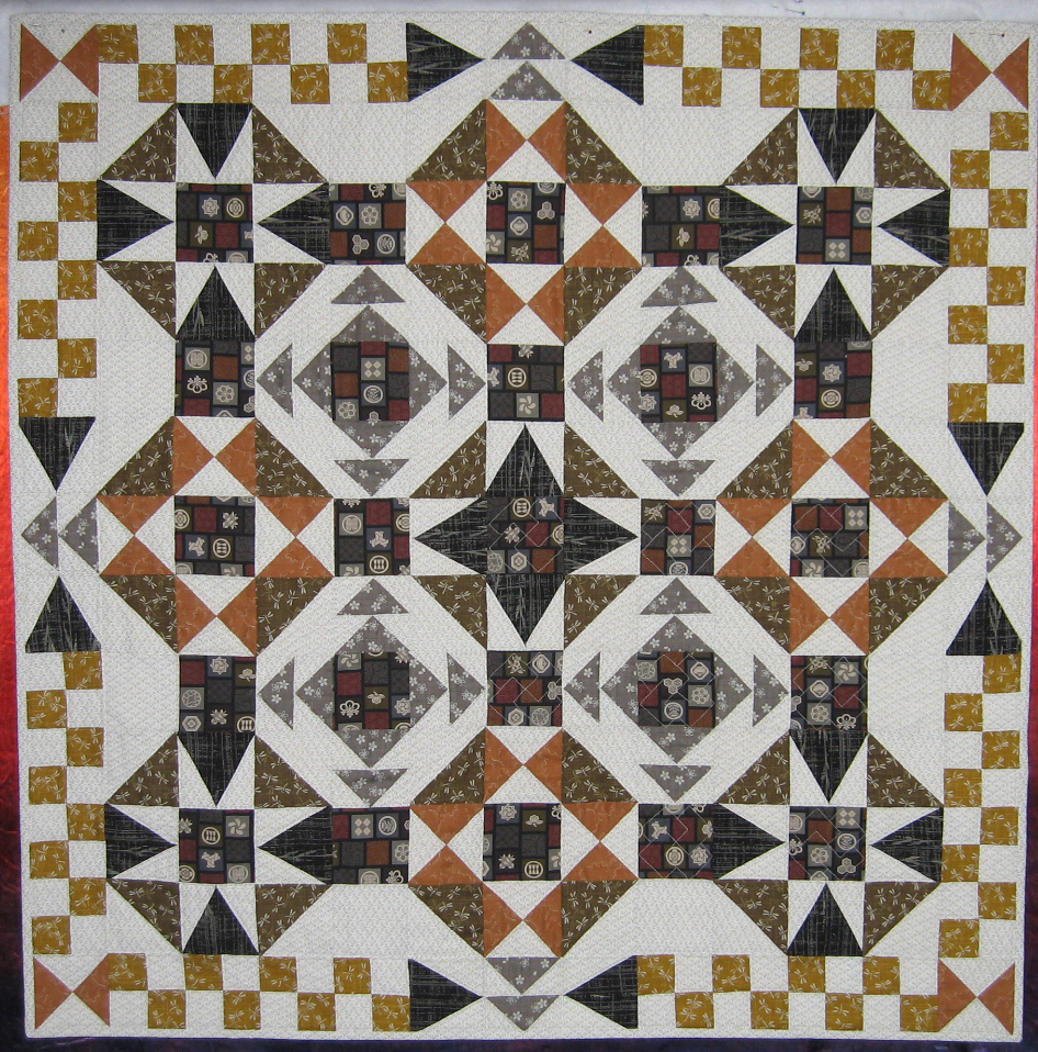
In honour of this momentus occasion I thought I would share a couple of my older pieces. The first is the last 'tradional' quilt I made. At the time I was a still a member of a local quilt group and the piece was a result of one of their workshops. I called it Slapdash because my points don't all match (sorry quilt police!). I only actually finished this in 2012 - it felt important to finish it, a like closing a door on a previous life. It is just over a metre square and I'm looking for a loving home for it.
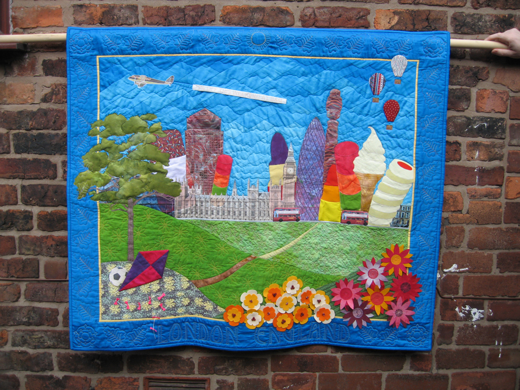
The second piece is called London, England and was completed for a Quilters Guild challenge at Festival of Quilts in 2010. I made this after finishing my City and Guilds Diploma. I had spent nearly four years immersed in Gothic Cathedrals as a design source and needed some light relief. So I made this without using a sketchbook or creating samples. Do you like the very professional photography! I'm not only going to keep this, I'm going to hang it in my grandsons new bedroom - I think Thor and The Hulk would appreciate giant ice creams!
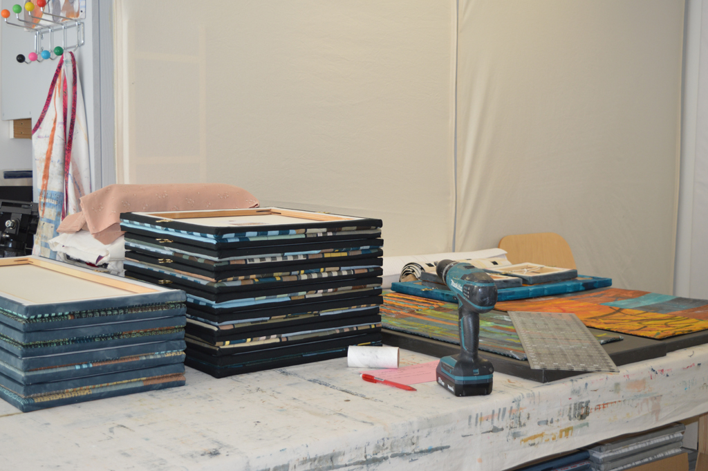
 One of the screens I use for my Ruins series has small rectangular windows permanently masked out using acrylic paint. It was a screen I originally used in my Hidden Message series. When I'm making other breakdown screens for Ruins I 'roll off' unused thickened dye onto this screen. I keep adding layers as I make and print more screens. The small screen often sits around for months until I decide it has enough dye on it. I then print through with thickened paste. And stand back and admire, lovely! Another method I use a lot for breakdown printing is using narrow strips of masking tape to create a wonky barcode on the screen. I then use a roller to spread thickened dye on top before leaving it to dry. Once dry I pull off the strips of masking tape and print through with paste. I love the way the lines breakdown and the colours blend as I continue to pull through!

 After a couple of months of composition, contruction and stitch I am back at my print bench doing what I love best - breakdown printing! I'm not trying to make a glorious piece of wholecloth. I'm printing fabrics which are going to be cut into smallish pieces before being reassembled. So there is no agonising over where to place my screen. No worrying that I've ruined the piece by laying down one too many prints. Just joyous, carefree application of colour, shape and texture to cloth. Accompanied by loud music and to be followed up by a glass of wine. Call me sad but life does not get much better then this!
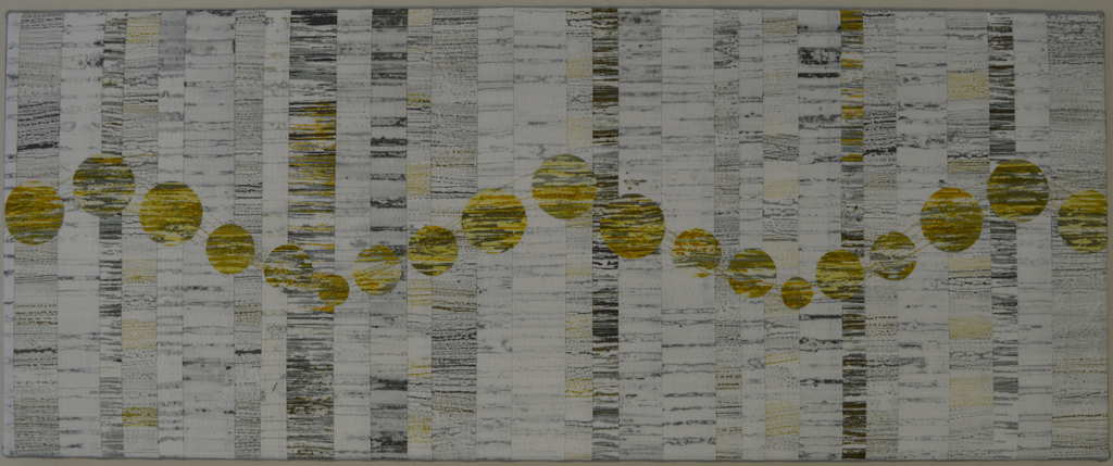
 After several months of working on my Still / Storm series I am taking a break and focussing back on my Ruins series. But before I do here is a small preview of Storm 1 (Jagged) which I will be submitting to the


 Here's a sneak preview of Storm 2 (Dark). I didn't start with the intention of stitching lots and lots of black lines but that is where I ended up. It makes the piece darker than intended, hence the title, and reflects my mood as I stitched.
 This is a topic that seems to come up quite regularly on social media / discussion groups. Some people like to use fairly descriptive titles, others prefer to use 'untitled'. I guess it depends on how much the artist wants to tell the audience about their inspiration for the piece. Working in series leads to other decisions - whether just to use Storm 1, Storm 2, Storm 3 etc or whether to add subtitles. In my Still series I am having my cake and eating it - Still 1 and Still 2 don't have have subtitles but Still 3 (Rest) and Still 4 (Flow) do. The subtitles came into my mind when stitching these pieces. Still 3 was very restful to stitch, and the stitching on Still 4 flowed across the surface.