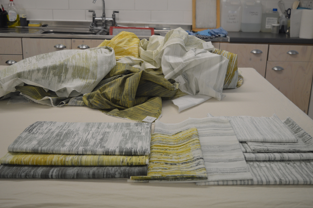
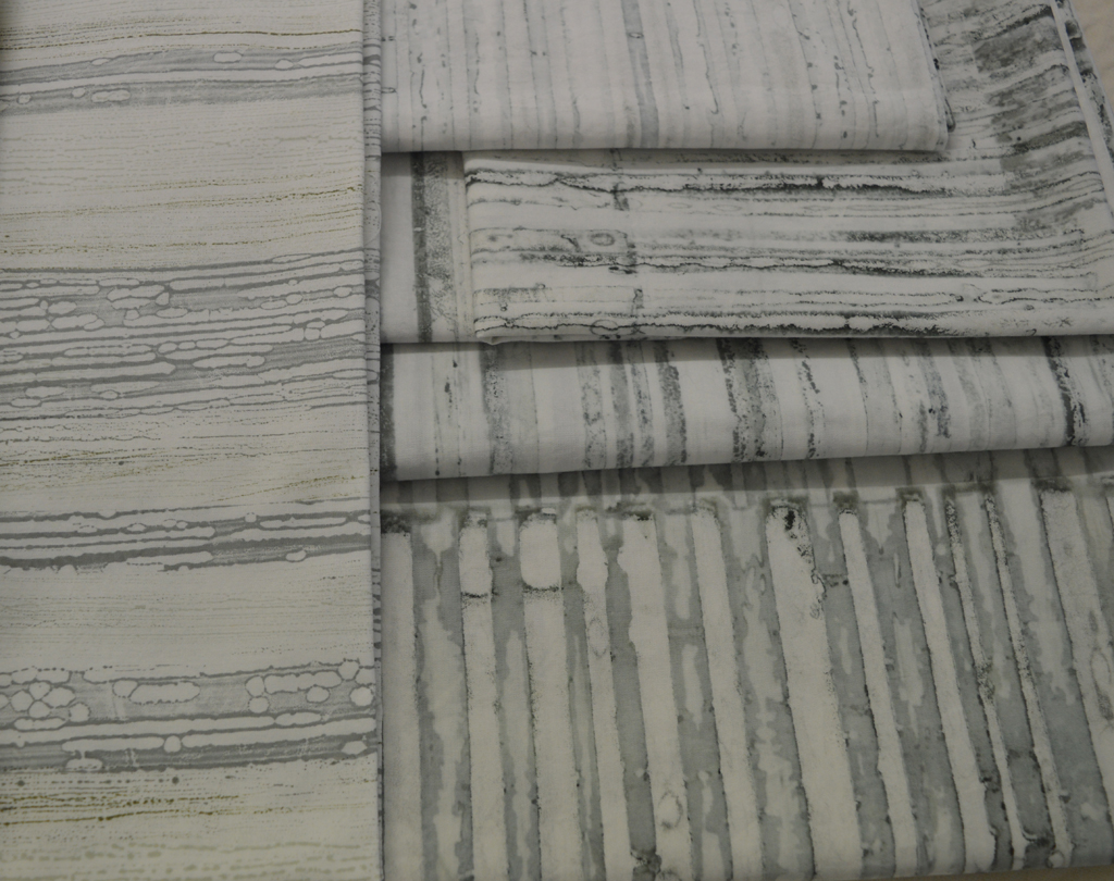
 It will come as no surprise when I say that 95%+ of the textiles I use in my work are created using breakdown printing. Sometimes I include dyed pieces, sometimes I add a layer of print using thermofax but breakdown is my love.
For the last few years I have printed knowing that the majority of cloth is going to be cut into rectangles and used to build backgrounds for series like Ruins. Which means that I don't think about composition when making the screens. I may choose square type shapes to embed or keep things aligned in one direction. When I print the screens I tend to place the prints side by side until I have filled the piece of fabric. Again I'm not thinking about composition. I occasionally cut out a particularly lovely section of cloth to use to cover book board but mostly the cloth gets cut down and pieced.

I love this process and expect to be using it for years but I'm also keen to find new ways to use breakdown - I love experimenting. I've played with printing with both thickened dye and discharge paste before batching my cloth. I've played with multiple layers of colour on a screen. Both gave interesting results but didn't fit with what I was trying to achieve at the time.
And then I saw some images on Instagram by the lovely Leslie Morgan of Committed to Cloth / the Creative Studio and had a lightbulb moment. Leslie and her students were painting thickened dye on screens to give very defined shapes (often buildings) then experimenting with colour exchange when they printed off the dried screen. Wonderful stuff that got me thinking about positive and negative space and how I could use breakdown screens to create series of monoprints.

So I have been playing. And having so much fun. Watch this space ..

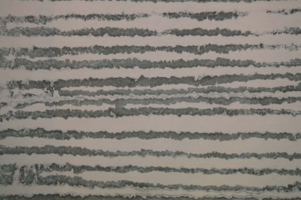 In between wrapping presents last week I did manage to prepare and pull some breakdown screens. I got some really promising marks by using a screen made with torn strips of freezer paper gently ironed onto the screen before rollering on a very thin layer of black thickened dye. I also made a screen using strips of torn masking tape. I wanted the marks to be delicate so pulled through with lots of print paste. And replaced the paste if it got tinted with colour.

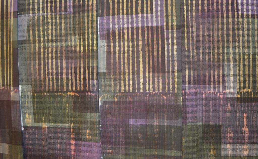 It is a good job that I have a Plan B as my experiments over the last week or so have failed to give me a 'WOW' moment. The results didn't even fall into the 'Ugly Duckling' category of pieces that might fit in with what I'm trying to achieve with some additional process. The experiment has been educational but not in any way that is connected with what I think I'm trying to achieve.
 One of the things I like about my new day job is that there is less travelling and generally more 'regular' hours. I will have more time in the studio and be better able to plan my output.
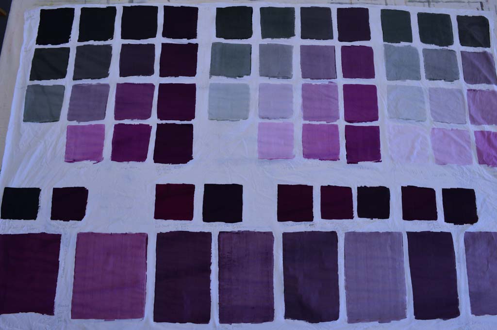 I've written about colour families before. I learnt about them on a wonderful class with


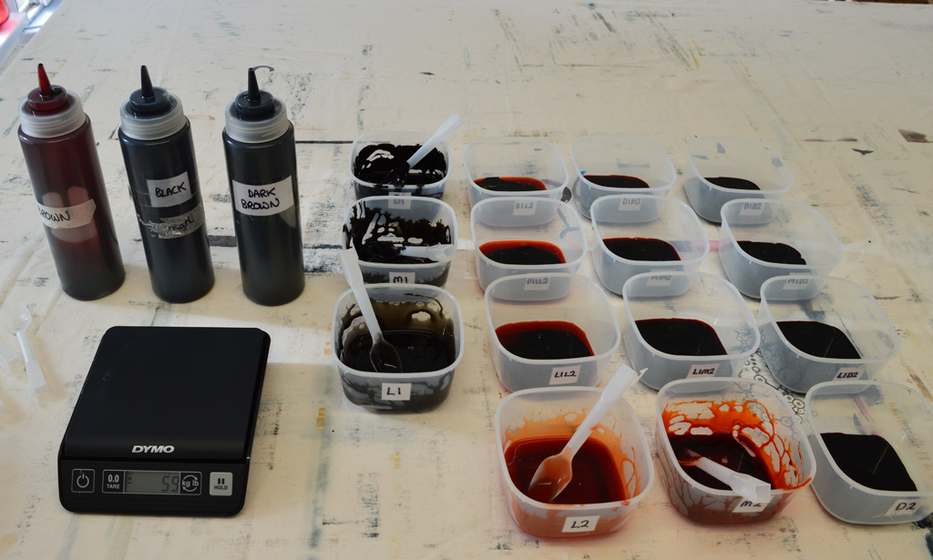
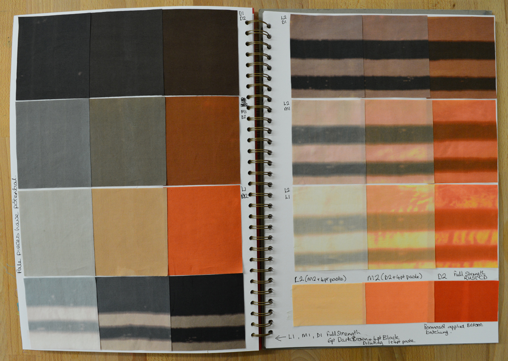
 There's a saying 'make hay while the sun shines' which would be a silly way for me to fill my weekend. I don't live on a farm and I'm already suffering with hayfever. I prefer 'make breakdown screens while the sun shines'. The weather is glorious and I've taken full advantage this weekend to make and print off multiple breakdown screens. In between, as the screens dry out, I have sat on my new garden furniture drinking good coffee and contemplating life. Only in the UK could that furniture have been covered in snow 2 weeks ago!


 One of the screens I use for my Ruins series has small rectangular windows permanently masked out using acrylic paint. It was a screen I originally used in my Hidden Message series. When I'm making other breakdown screens for Ruins I 'roll off' unused thickened dye onto this screen. I keep adding layers as I make and print more screens. The small screen often sits around for months until I decide it has enough dye on it. I then print through with thickened paste. And stand back and admire, lovely! Another method I use a lot for breakdown printing is using narrow strips of masking tape to create a wonky barcode on the screen. I then use a roller to spread thickened dye on top before leaving it to dry. Once dry I pull off the strips of masking tape and print through with paste. I love the way the lines breakdown and the colours blend as I continue to pull through!

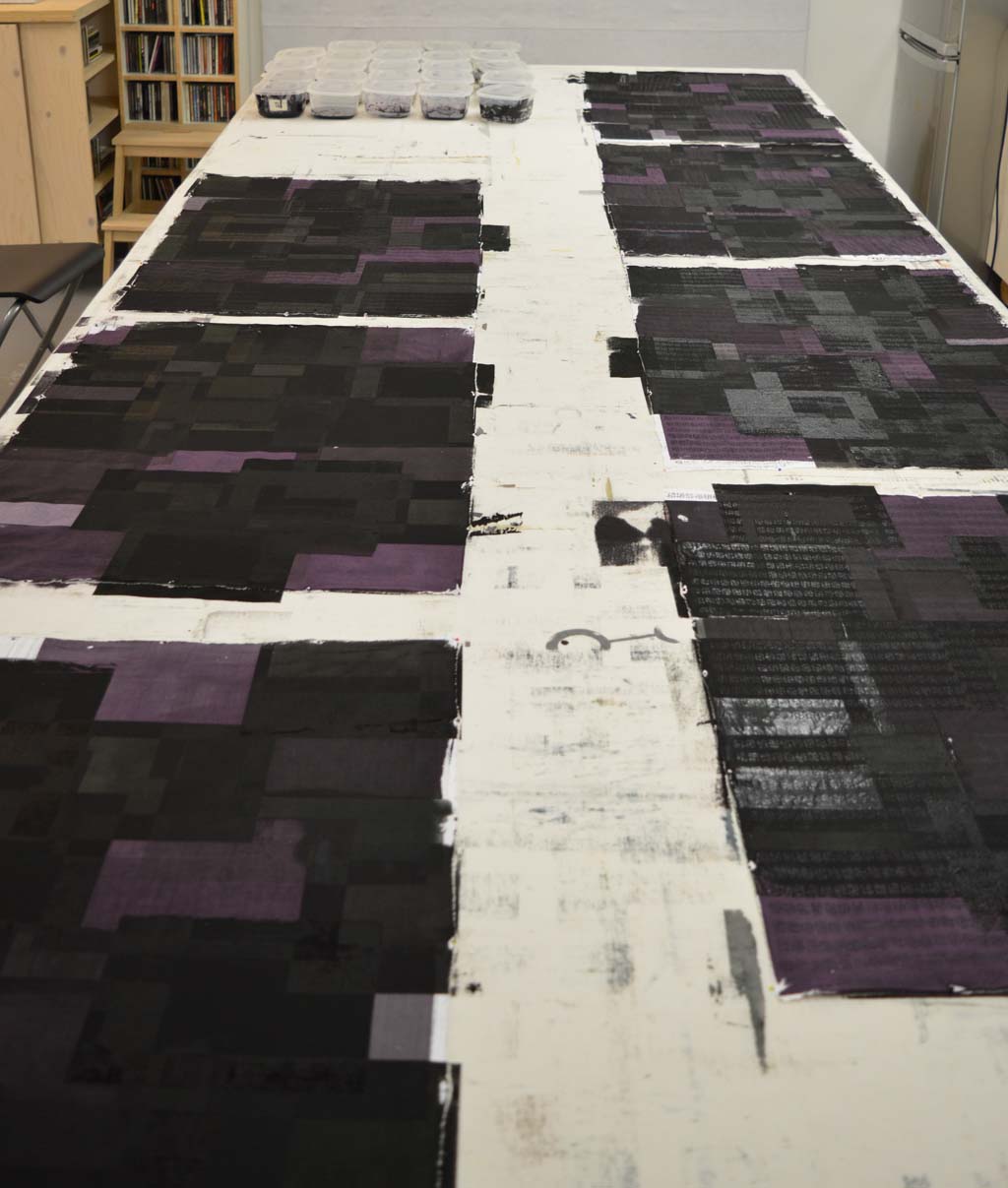
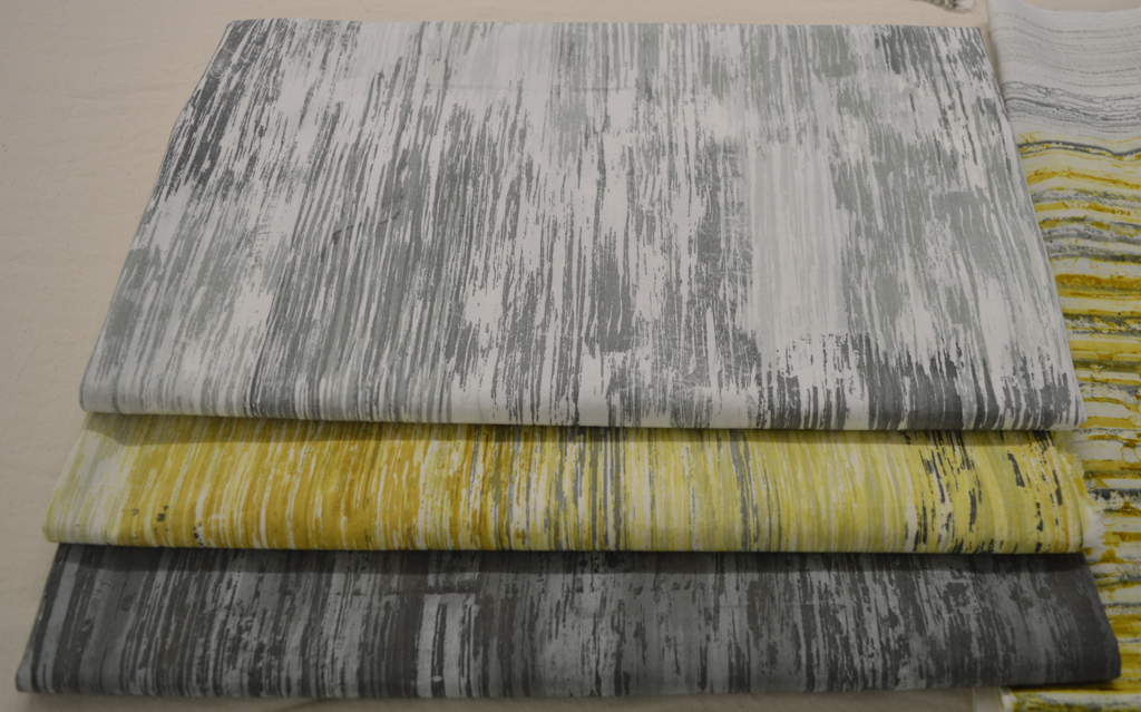 I've spent the last couple of weeks at the bench printing fabrics. I love it! It is a little bit like a merry-go-round, once you're on it is difficult to stop. But stopping and assessing is really important so yesterday I cleaned, tidied and finished rinsing out and ironing the fabrics. This morning I looked at what I had printed. I used the samples that I have been stitching to help and used the trick of framing small sections. I have printed approximately 18 square metres of fabric. About half is 'perfect' and so will be put through a final machine wash to make them ready for use. The other half need additional work. Some just need a few lines adding but some need some serious intervention! (And, being honest, a couple probably need throwing in the bin!). These will all be soda soaked again and hopefully printed over the next week. So lots more fun at the bench!