Posts in Techniques
Sometimes I wish there was a second me .....
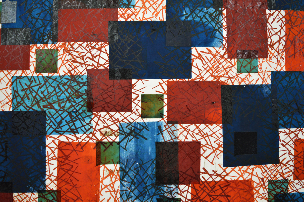
I stretched some string across the fabric and added some shredded paper. I used an open screen with rust brown and petrol green thickened dyes. The screen picked up pieces of shredded paper as I printed creating a rather chaotic pattern. I didn’t li…

I stretched some string across the fabric and added some shredded paper. I used an open screen with rust brown and petrol green thickened dyes. The screen picked up pieces of shredded paper as I printed creating a rather chaotic pattern. I didn’t like the areas of white, unprinted fabric so used a plastic card to scrap very pale petrol green across the whole piece.

Sometimes I wish there was a second me. Alt-Leah would go with the flow; she would be spontaneous. She wouldn’t have a plan A, B or C and definitely wouldn’t track her hours in the studio. Today is a lovely sunny day so alt-Leah would probably have kidnapped her grandson from school and driven to the coast to play in the sand, paddle in the sea and eat fish and chips out of their paper followed by ice cream. Tomorrow she might spend the day making replacement cushion covers for her garden furniture using the fabrics she printed during the Simply Screen Printing workshop she ran at the weekend. Because they really are rather lovely fabrics. Which isn’t always guaranteed when demonstrating techniques.

Unfortunately there is no alt-Leah, just me with my somewhat ambitious exhibition at Festival of Quilts to make art for. So these lovely fabrics will join an increasingly large pile of fabrics that I can use as teaching samples. But I can at least give them an audience! And, of course, there was the wonderful work my students did!

This piece was printed using a thermofax screen and screens made using positive and negative sticky back plastic resists. Again I used rust brown and petrol green thickened dyes and killed the white space with a layer of very pale petrol green.

This piece was printed using a thermofax screen and screens made using positive and negative sticky back plastic resists. Again I used rust brown and petrol green thickened dyes and killed the white space with a layer of very pale petrol green.

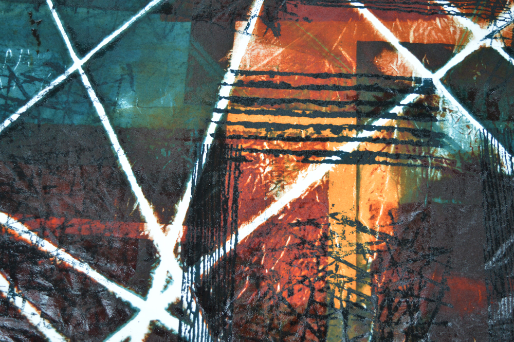
In this one I used masking tape to add a resist to my screen. I used the screen to print on top of crumpled fabric. After each print I moved the screen and carefully transferred the textured dye that had clung to the back of the screen onto this pie…

In this one I used masking tape to add a resist to my screen. I used the screen to print on top of crumpled fabric. After each print I moved the screen and carefully transferred the textured dye that had clung to the back of the screen onto this piece of fabric. Difficult to explain but a great technique. Same colours and again finished with a layer of very pale petrol green.

This was the piece of crumpled fabric that I printed onto. It gets a bit messy as you rearrange the fabric in-between each print. I got distracted when I was printing this and stopped too soon. There was lots of white fabric so I added a layer of in…

This was the piece of crumpled fabric that I printed onto. It gets a bit messy as you rearrange the fabric in-between each print. I got distracted when I was printing this and stopped too soon. There was lots of white fabric so I added a layer of intersecting lines using a thermofax screen. Same colours and same final layer.

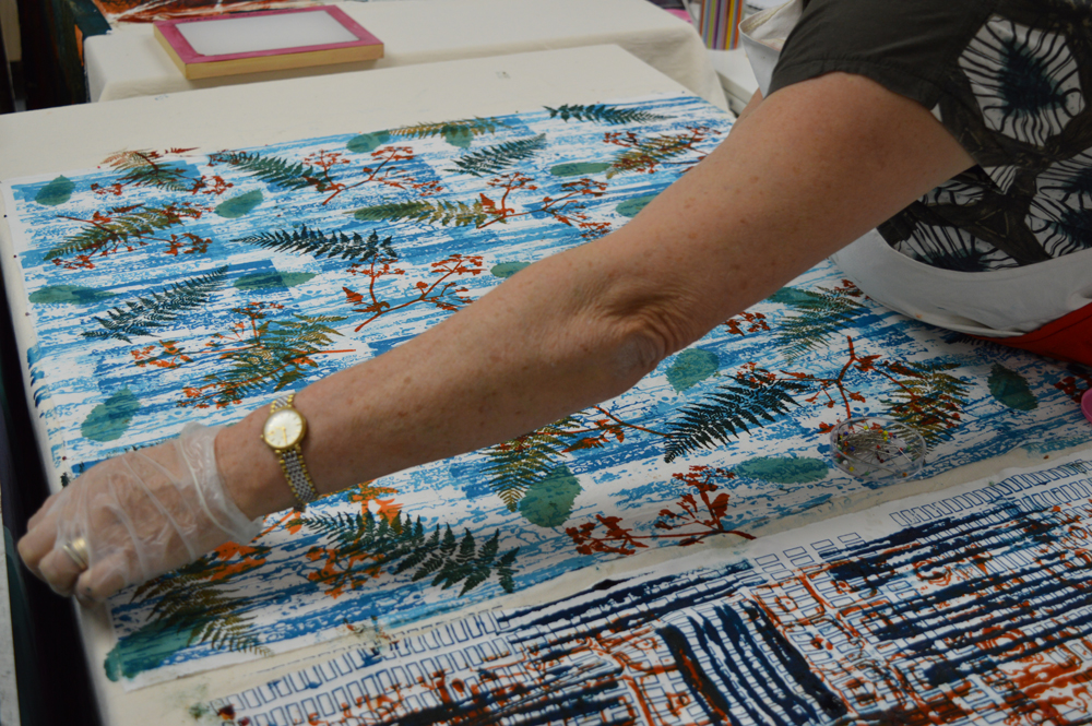
Top left: Val Lewis breakdown printing. The screen was made with black thickened dye and she is pulling through with a slightly muddy golden yellow.

Top right: Val again, she used a thermofax screen and great colour control.

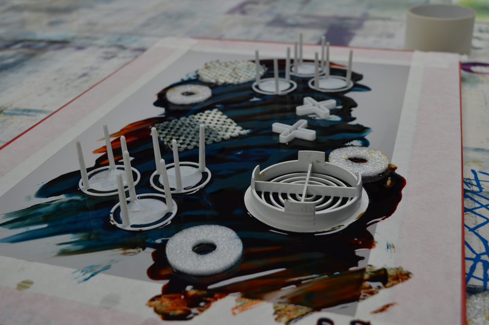
Bottom left: Pat Allen’s breakdown printed fabric. The screen was made with a black grid and objects embedded in turquoise dye.

Bottom right: Hilary Fidler using a plastic card to add a final layer of pale colour. Her first layer used an open screen on fabric that had shredded paper and paper circles scattered it. Her second layer was thermofax motifs in a mustard yellow.

Teaching and learning
Work in progress by Maggie Pearson

Work in progress by Maggie Pearson

In my old life I used to do spend some of my time training people how to use particular pieces of equipment or how to carry out specific tests. I knew the equipment and tests inside out. There was always a correct and incorrect method. A needed to be followed by B which needed to be followed by C etc. With experience I learnt to pass on the information more effectively but it was always the same information.

Teaching surface design is very, very different. Yes, there are a few rules that have to be followed if you want the colour from your Procion dyes to fix to your fabric. (Always remember soda + moisture + heat + time). And I do supply my students with sets of recipes that they can choose to follow rigidly (or not!). But pretty much everything else is about personal choice. There are no rights or wrongs, just choices. So my role as a teacher is that of an ‘enabler’ providing encouragement and support. And I am still learning how to be a good teacher. The more classes I teach; the more students that I spend time with, the more I am learning to tailor my support to fit different needs. My students tell me that I am very well organised - writing class notes, preparing lots of samples, labelling all the cupboards is stuff that comes easily to me. Learning how to nurture the creative process in others is harder but so very satisfying!

The other difference is depth of knowledge. Or in some cases, lack of depth. I have spent hundreds of hours over the years screen printing (especially breakdown printing) and dyeing and, although there is always more to learn, I can teach with confidence. But there are some areas of surface design where I have not spent hundreds of hours, where my skills are a little ‘wobbly’. Of course I rehearse before class but the reality is that I will be learning just as much as my students. I facilitate, I enable and, in return, my students inspire me. Which is actually kind of wonderful!

Evolution part 2
7 April 2019 1.jpg

Time to get real ….. I’ve auditioned fabrics and stitched some samples but now I need to commit to a ‘proper’ piece. And for me that inevitably means a large scale piece. Time for a quick drawing on a scrap of paper to work out exactly what size and I’m off!

7 April 2019 2.jpg

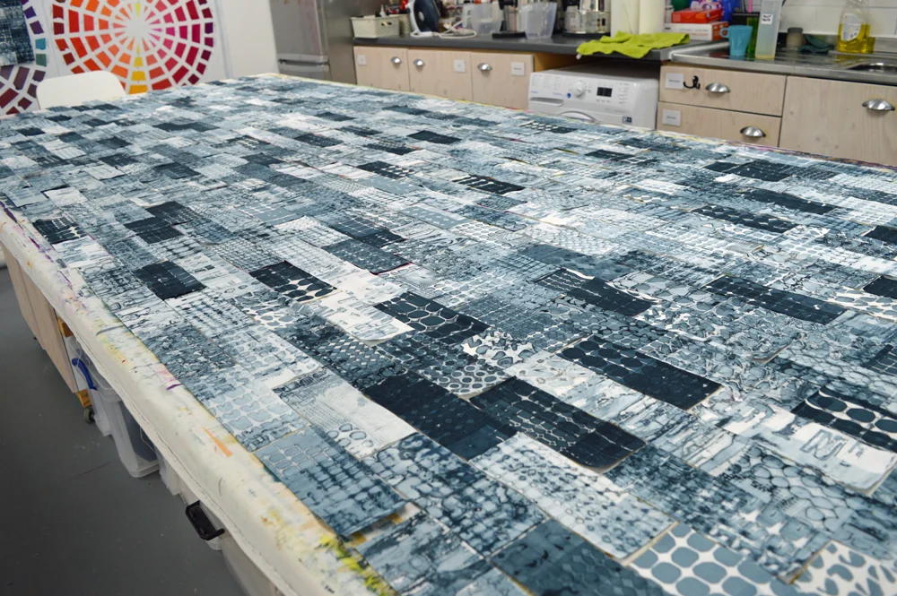
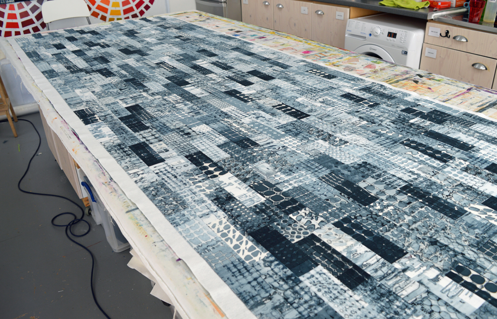
First I take all my beautiful breakdown printed fabrics and cut them into rectangles. I don’t ‘cherry pick’, I just cut everything up. I take the cut pieces and jumble them up then close my eyes and pull them out one by one ready to lay them down in rows on my big print bench. I try to make this process as random as I can. The control freak in me would agonise over this part of the process and would inevitable produce a background that would not be as interesting as when I let serendipity happen.

7 April 2019 3.jpg

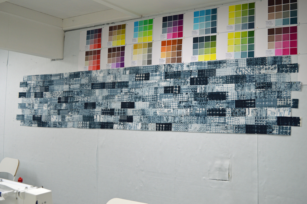
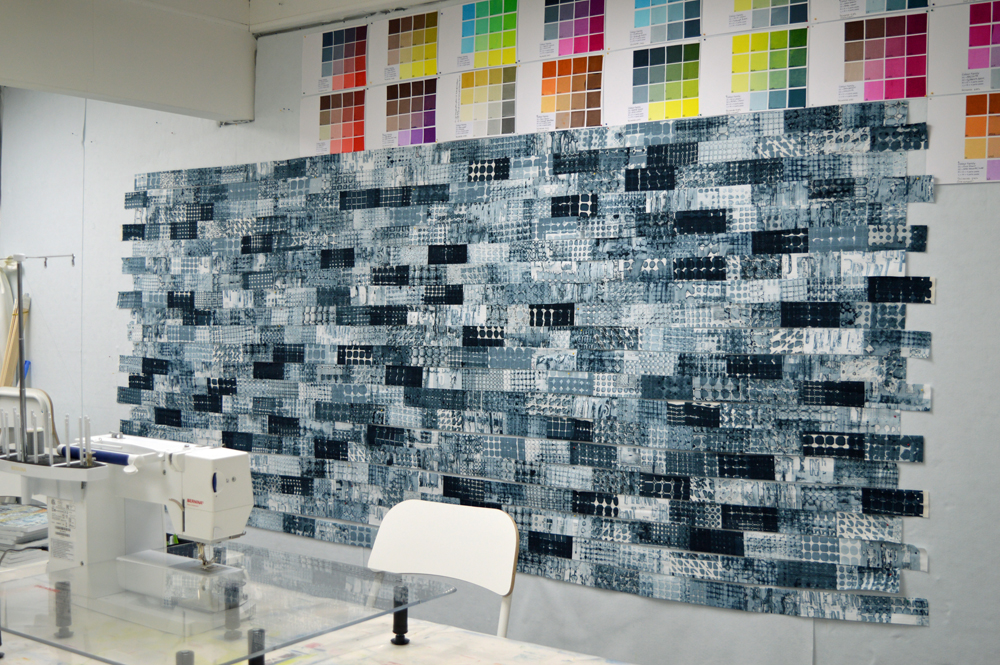
I sew the pieces together into long rows and put them up on my design wall. I like to leave the rows up there for a while and allow myself to change a handful of pieces to balance the colour and composition of the background. Just a handful - I do not give in to the temptation to change too many pieces!

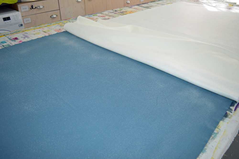
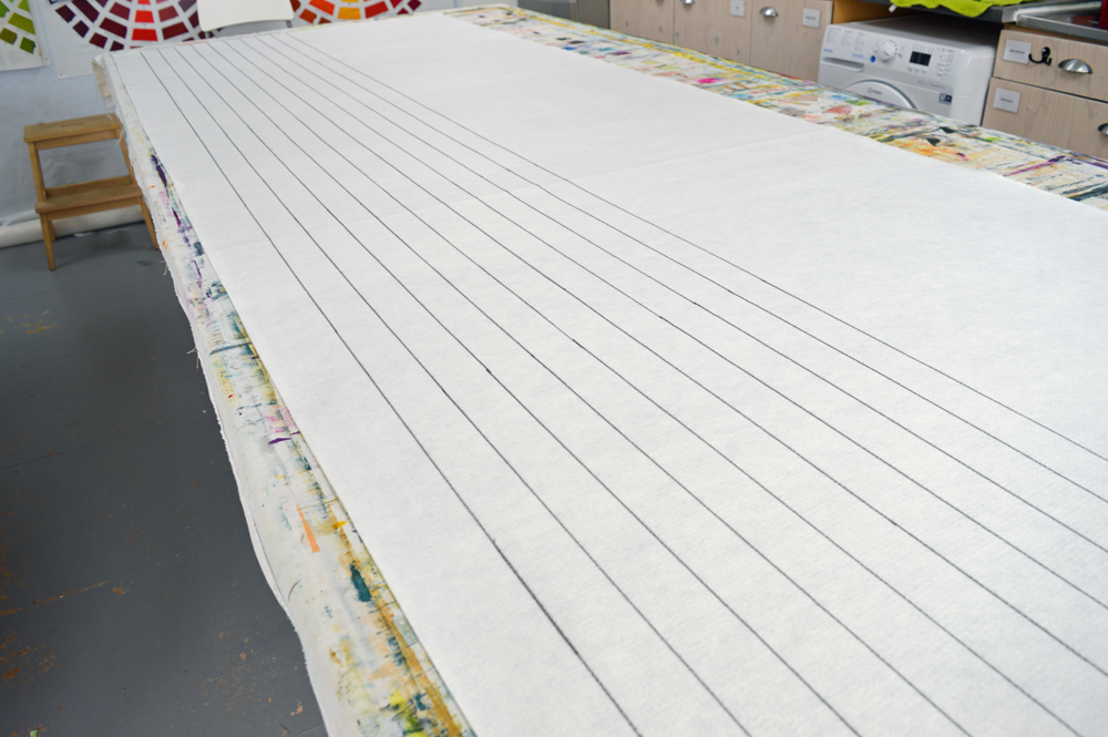
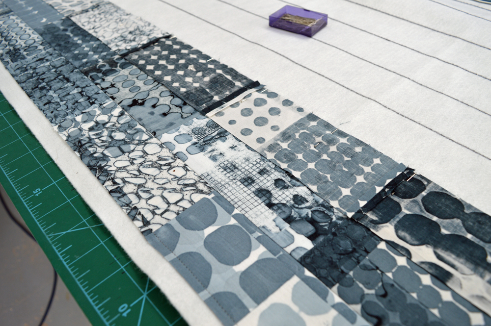
I then prepare my backing fabric and my wadding (I use acrylic felt as I like how flat it is). Having cut them to size I use an adhesive spray to stick them together. I draw parallel lines, 2 inches apart, on my wadding and use a ‘stitch and flip’ process to sew my rows together and to the backing in a single process. This way I can ensure that my rows are sewn together accurately. Yes, I fully embrace my inner control freak for this part of my process! And it has the advantage that I don’t have a separate basting stage. I have always hated basting quilts!

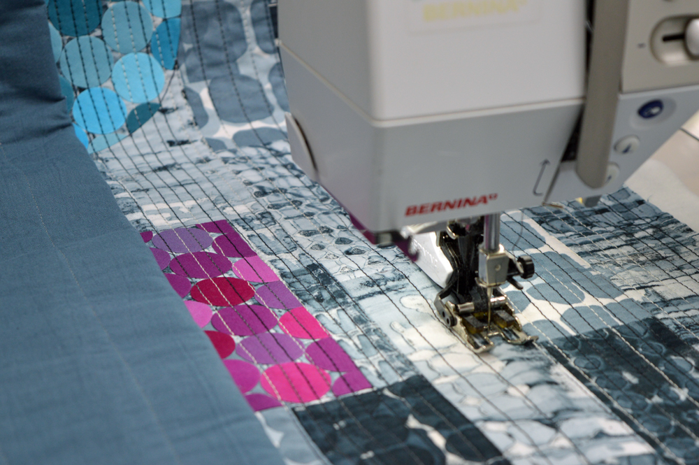
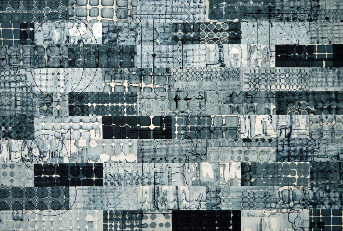
I now have my background. It is ready for me to add what I call my top structures and to add stitch. As with my Ruins series I am stitching lots and lots of parallel lines in my new Print series. I can’t image not adding stitch but at the same time I don’t want the stitching to distract from the fabrics. Simple lines seems to work well with fabrics that contain so much detail. In one of my samples for this series I stitched a word as my top structure. I’ll probably use this idea for one or more of the pieces I will make in this series but for this first piece I had a light bulb moment and have gone in a different direction. And it is a direction that could not be sampled on a small scale piece. Yes my ‘sample’ is 290cm wide by 100cm high and is going to have a prime position in my upcoming exhibition so you only get see these work in progress shots!

There is a saying that fortune favours the brave …. I’m certainly hoping so!

Evolution part 1
2 April 2019 2.jpg

A few weeks ago I wrote a post about my upcoming solo gallery at this summers Festival of Quilts. I’ll be exhibiting new works from three connected series. The newest of the three is inspired by the evolution of the print and publishing industry as it has responded to changes in demand and in technology. As with all of my recent work the ideas evolved in my head and at the bench whilst I was busy working on other things - as I said last time I don’t sit round waiting for the muse! So here is the story of a series that I am calling ‘Print’.

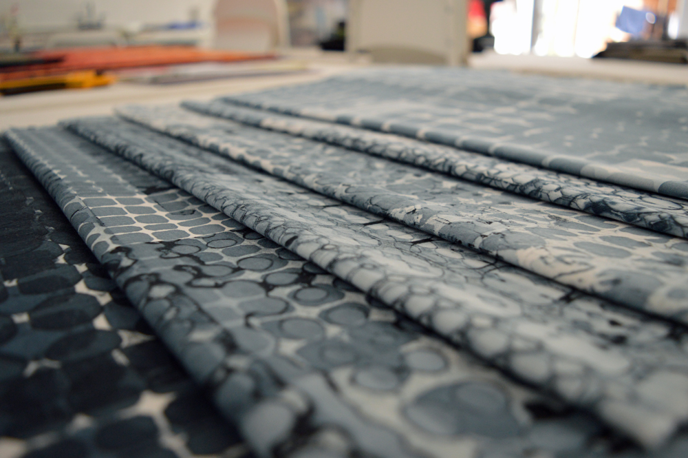
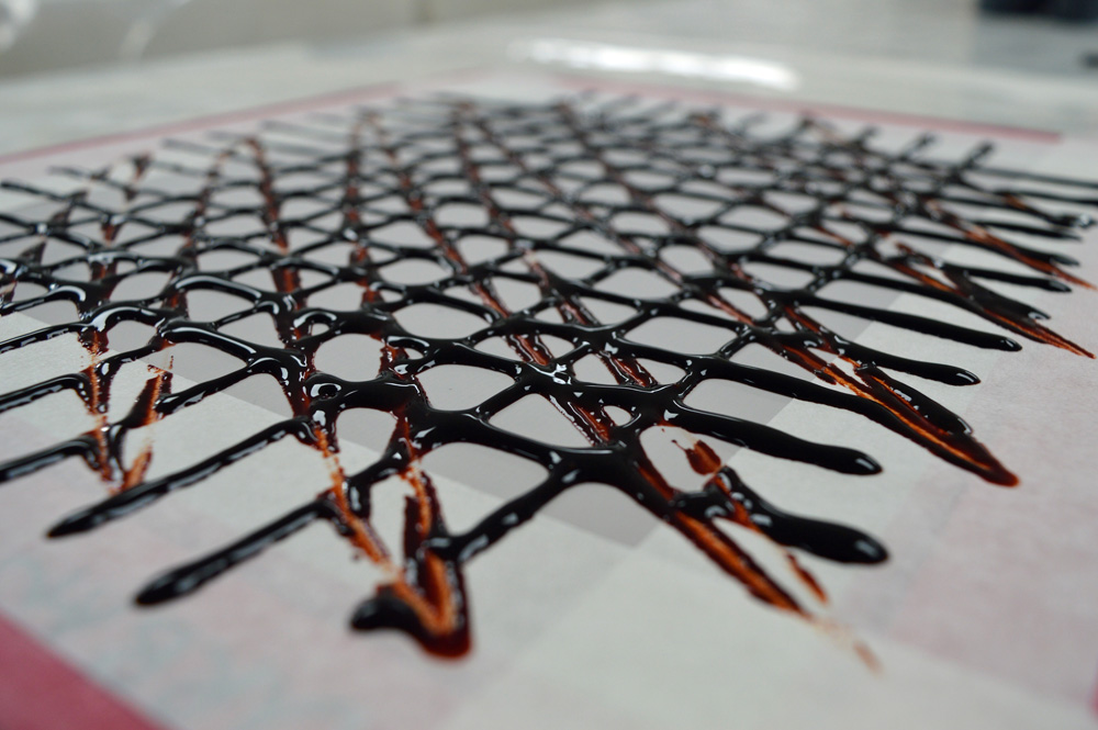
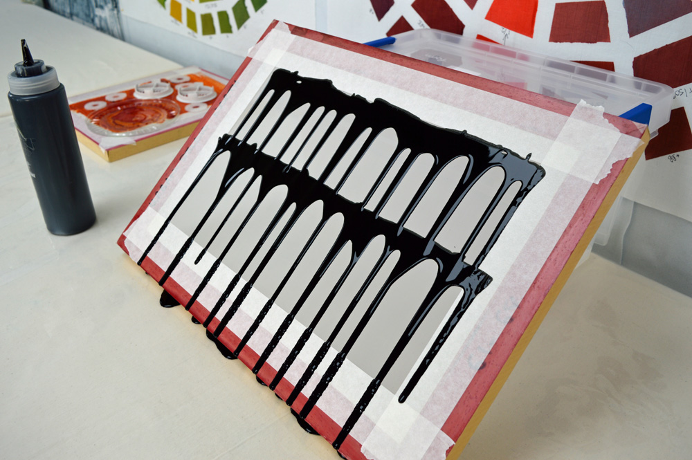
Last summer I took a few days out from preparing my studio (and myself) for teaching to do some breakdown printing. I set myself the challenge of just using black thickened dye in a squeezy bottle to create lots of different grids. I had sort of started thinking about writing my first book and thought this would be a good starting point. I also wanted to create a small breakdown printed quilt to use on my stand at last summers Festival of Quilts. I wasn’t thinking ‘ART’ but as I started cutting into my printed fabrics I was started thinking about the print industry and my connections with it. I made a small quilt which I called Process Colour #1. And went shopping for some old wooden print blocks which I thought I might try to incorporate in ‘something’ … no firm ideas of what but wheels had started turning in my subconscious.

Process Colour #1 blog.jpg

A couple of months later and everything seemed to come together in my head … In my old corporate life I was involved in printing tufted textiles on an industrial scale, in my art life I printed my own unique fabrics. I sometimes use thermofax screens which utilise old technology from the 1950’s. My daughter and her partner have long been involved in the self-publishing / zine movement (check out Good Press). I had spent the autumn trying to get my husband to throw out some very old Gestetner printing supplies 30 years after he used a Gestetner duplicator to print his own zines. And now I was going to self-publish my first book (Breakdown Your Palette). So many connections. And there is so much history when you look at the print and publishing industry. So many changes in technology. Wood block printing to movable type. Printing presses to lithography to inkjet and digital printing to 3D printing. The written word being accessible to the privileged few to mass publication to the growth of the internet and ebooks.

And so I spent another week printing more fabrics. Just using black thickened dye but incorporating embedded wooden print blocks with my grids. Playing with new ideas. Auditioning fabrics. Making a sample utilising thin strips. Promising but still not quite right.

2 April 2019 1.jpg

All more fuel for my mind to mull over. At some point I decided that I would create pieces using the same ‘brick wall’ background as I wanted that connection with my Ruins series. And sampled this as a piece for my Cloth in Common group. In this quilt I stitched the word ‘offset’ on top of a background made using my breakdown printed fabric. Definitely going in the right direction. Which is just as well as I need to make pieces for the exhibition. In my next post I will share the process for making my first large scale piece in this new series. My ideas will continue to evolve as I make each piece …..

1-9Higgins Times New Roman.jpg
Happily exhausted!
20 March 2019 3.jpg

Two four day shows in successive weeks with just two days at home between them was always going to be a ‘challenge’ but what a wonderful way to exhaust myself! The Fashion and Embroidery Show at the NEC, Birmingham was brilliant. I was delighted to be given a bigger stand than expected as it meant I could take more quilts to show. I decided to show one of my big Ruins quilts on the back wall and was overwhelmed by the response - so many wonderful comments. Big, big thank you to everybody who stopped by the stand!
And a super, big thank you to my son, Joe, who came to both shows with me. I simply could not have done without him. He even did a bit of printing when I was busy away from the stand! This is definitely a family affair.

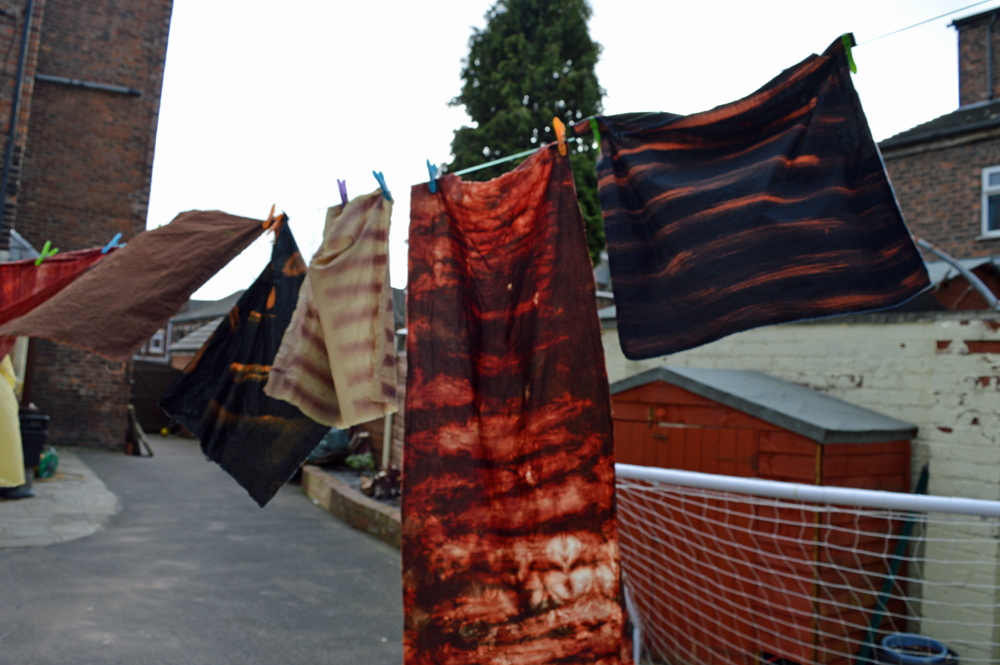
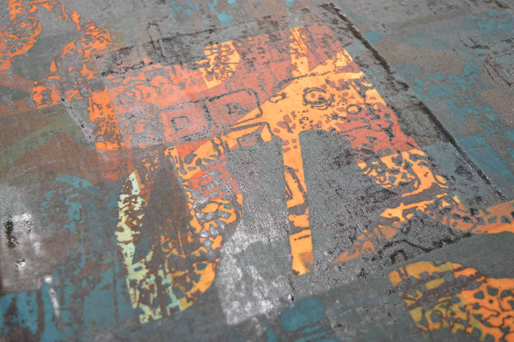
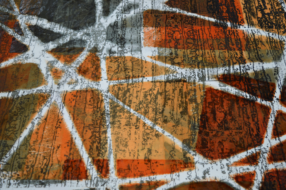
And now I’m home and have just finished washing fabrics, cleaning screens and catching up on paperwork. For those of you who watched me printing at the shows below are some of my demonstration pieces from the shows. The piece at the top of this post was printed in Birmingham.

I’ve indulged in an afternoon nap and a couple of early nights. Batteries fully recharged. What next? Making lots and lots of art for my exhibition at this summers Festival of Quilts. Living the dream!

Printed in Glasgow, breakdown printing and printing using screens with torn masking tape resists.

Printed in Glasgow, breakdown printing and printing using screens with torn masking tape resists.

Printed in Birmingham, all breakdown printing.

Printed in Birmingham, all breakdown printing.

Discharged with full honours!
11 Feb 5.jpg

My day a month Introduction to Surface Design students continue to amaze me! This last weekend we focused on discharge which is the process of removing colour. We used four different discharge agents, two as liquids and two as pastes. This allowed the students to screen print, thermofax print, resist discharge in a vat, paint and use low immersion techniques. Great fun albeit a bit smelly at times!

Linda Hill - thickened Formosol applied using a screen with a masking tape resist

Linda Hill - thickened Formosol applied using a screen with a masking tape resist

Jean Martin - collection of fabrics discharged using thickened Formosol and deColourant

Jean Martin - collection of fabrics discharged using thickened Formosol and deColourant

Using discharge can add new lines or shapes to a dyed or printed fabric. Although it is a process that removes colour the fabric rarely goes back to pure white. More often you get pale shades so I think of discharge as a process that adds more colour. It is an integral part of surface design. But it is also a great tool for ‘recovering’ fabric that you don’t like. I call my Thiox immersion vat the redemption bucket!

The discharge process is also covered in depth in my 5 day Colour Your Palette workshop. Places are still available for the course in April. More details can be found here.

Jan Walmesley - thickened Formosol used with a thermofax screen

Jan Walmesley - thickened Formosol used with a thermofax screen

Lynda Edwards - discharged using household bleach

Lynda Edwards - discharged using household bleach

Simply WOW!
Work by Lynda Edwards

Work by Lynda Edwards

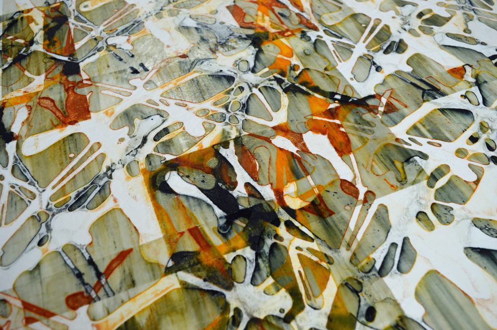
This last weekend the eleven students in my Introduction to Surface Design groups printed some absolutely fabulous pieces of fabric. It was a real pleasure to watch them work and witness the occasional happy dance. The sessions were on using screen printing, thermofax screens, masking tape, string and paper resists to create backgrounds. They all watched me give the same demonstrations and had access to the same tools but each produced truly unique work. Brilliant!

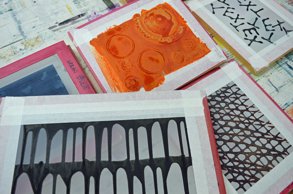
Work above by Sue Wharburton, Maggie Pearson, Debs Nixon and Lynda Edwards. And below - breakdown screens ready to be pulled during next months sessions.

11 December 2018 1.jpg
Better get a wriggle on!
6 dec 18 2.jpg

I have my two ‘day a month’ groups in the studio this weekend and it is a bit of a tip. Since getting home from Harrogate I’ve been busy breakdown printing different samples, soda soaking fabric (and drying it in the studio), ordering and sorting out Christmas presents (bah humbug), doing paperwork and generally making use of every bench. Around all of that I have been doing a bit of mark making and have done a bit more decorating in the bog shed. I may even have got some sleep!

Before my lovely students arrive for their Introduction to Surface Design session on screen printing I need to:

  • Soda soak a few more pieces of fabric then clean up the mess this leaves on the floor. The weather has been very uncooperative this week!

  • Varnish another 5 screens - meant to do this months ago when I could have left the studio doors open to get rid of the smell (apologies students!)

  • Rinse, wash and iron all the breakdown samples and put a few of them up on my design wall. Hide the ones that are perfect illustrations of how NOT to breakdown print.

  • Load the rest of the design wall with quilts and samples that show various aspects of screen printing.

  • Make some more thermofax screens based on mark making for my students to use as background texture this weekend.

  • Decide on the colours I’ll use in my demonstrations this weekend and test drive the new thermofax screens.

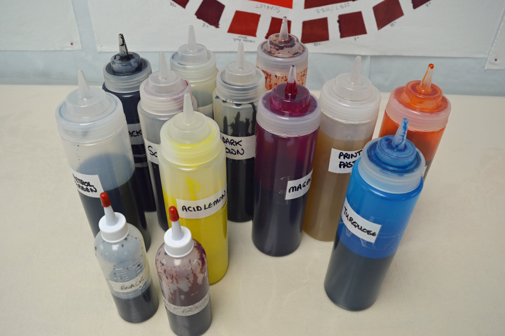
  • Top up the print paste and thickened dyes.

  • Double check that all my screens are really clean - a speck of leftover dye goes surprisingly far.

  • Move Harrogate / show boxes out of the studio into the storage part of the bog shed.

  • Clean the bog shed.

  • Open the Amazon boxes, wrap presents and find somewhere in the studio to hide them away from my grandson.

  • Clean the studio. A bit.

  • Make it look a bit Christmassy (but not too much, bah humbug).

  • Make sure there is a good supply of tea, coffee, juice and biscuits (must hide some of the dark chocolate gingers for the Sunday class). Thought about making mince pies. Decided to do more breakdown printing instead.

  • Get some sleep….

My next Introduction to Surface Design courses will start in February. If you’re interested have a look here. My studio might be a tip today but by Saturday it will be an oasis of calm and creativity. But only if I get a wriggle on …

6 dec 18 3.jpg
Sampling for others

Whatever I have done in life I have always tried to do well; to be the best that I can possibly be. Now I recognise that there are lots of things that I’m never going to be any good at (foreign languages, clean manicured hands, nurturing plants ….) but that’s OK because they are not important to me. However teaching in my studio is important to me so I am striving to be the best that I can be.

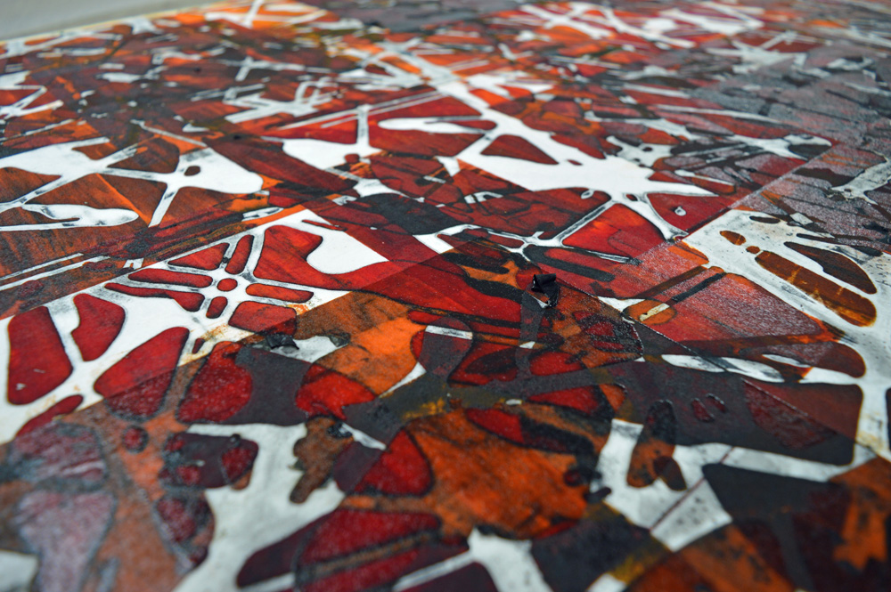
I have worked hard to organise and equip my studio so that my students have lots of space to work and so that they don’t have to bring masses of stuff with them. I have had great fun making colour wheels to help and guide my students. And I’ve worked through my lesson plans to make sure I have lots of relevant (and hopefully inspiring) samples. But I realised whilst I was at the Knitting and Stitching Show last weekend that I don’t have enough breakdown printing samples. Don’t get me wrong, I have metres and metres of fabric printed ready for the art I need to make for my solo gallery at next years Festival of Quilts but those fabrics are in ‘my’ colours and have been made using breakdown techniques that fit in with my personal inspirations.

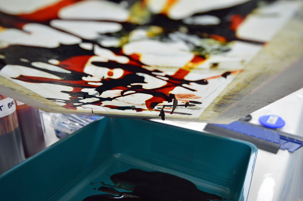
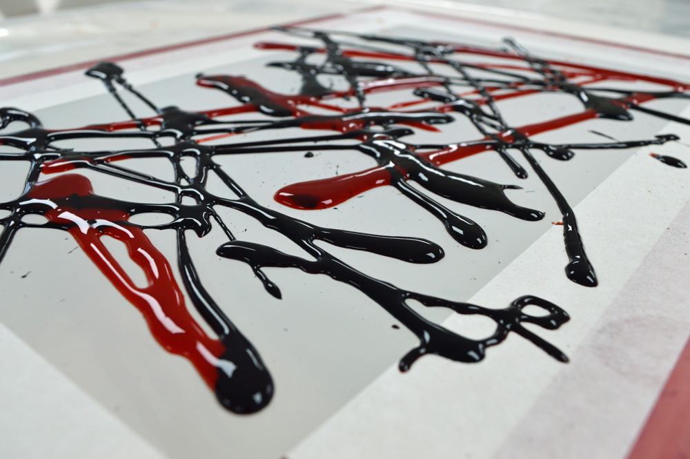
Not everybody wants to see rust and black fabric inspired by the decline in the cotton and mining industries. Strange but true. So this week I have been playing with other types of breakdown printing and with a slightly broader colour palette. I can’t quite bring myself to do pink flower inspired things or green landscape inspired things but I’ve had a thoroughly enjoyable time releasing my inner Jackson Pollock and squirting dye about. I may even let all my inhibitions go and print some screens at wonky angles. Blimey!