Posts in Techniques
Colour, colour, colour!

I love colour! And whilst I've always kept records of the colours I've mixed for my art I have never taken the time to systematically create colour blankets. Until now. Colour is fundamental to the classes I am teaching so creating resources to help my students understand colour seems like an obvious thing to do. And it has been so much fun, I wish I'd taken the time to do this years ago!

My favourite piece so far is the colour wheel above created by blending two primary reds - magenta and scarlet - and two primary blues - turquoise and royal blue. It's my favourite for two reasons. Firstly I didn't make any mistakes when making it but mostly because of the surprising colours you get when you mix scarlet with either of the blues. Instead of the 'purples' you might think you're going to get you get some beautiful browns.

When you mix the two primary blues with two primary yellows - acid lemon and golden yellow - all of the blended colours are colours that you would label 'green'. No surprises but using the colour wheel I can see instantly how to mix an olive green or a lime green. 

The third colour wheel mixes the primary yellow with the primary reds to create an abundance of oranges. What is interesting in this colour wheel is just how overwhelmed yellow is by red. Even a small addition of red creates oranges that are close to their red component.

And finally (for now!) I have stolen an idea from the excellent DVD 'Exploring Fiber Reactive Dyes with Claire Benn' to create what Claire calls colour tartans. I have created exactly the same 'tartan' on two different cottons - the cotton poplin that I use in my art and a more open weave plain cotton. The colours are extremely close although they are very, very slightly richer on the poplin which has a slight surface sheen. Doesn't really show up in a photo so you'll have to trust me on this. Or make you own!

Fully stretched
7 April 18 1.jpg

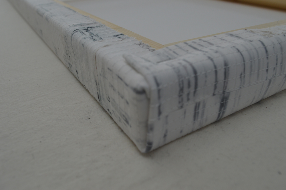
With the Stockport exhibition opening on 26th May it has been full on production at Studio Leah this last couple of weeks. I have been finishing a collection of 10 panels, each 40cm x 100cm, and each referencing a specific coal pit from the Lancashire and Manchester coalfields. These are part of my Traces series inspired by industries and industrial structures that no longer exist; that have been wiped clean from our landscape. Each piece is finished by stretching over a deep canvas. To help achieve crisp corners I did not use any wadding. Instead I fused two layers of cotton together which gave me a good firm surface to stitch on and a fabric that did not skew and distort as I stretched it over canvas. A few people have asked how I do the stretching so here we go.

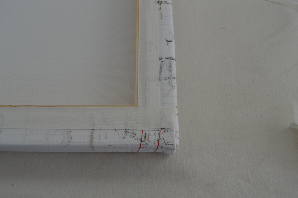
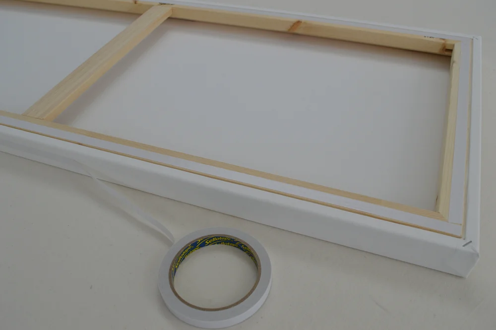
I use stretched canvases rather than stretcher bars as the canvas manufacturer has done all the hard work by stretching the canvas onto the frame. All I'm doing is wrapping my piece around it - I am not really 'stretching' the work. Looking at the above photos from top left to bottom right:

  • I prepare the canvas by adding double sided sticky tape to all four sides of the canvas and to all four edges on the back of the canvas. If I were stretching over a standard (narrow) canvas I wouldn't bother with tape on the sides.
  • I position the canvas on the back of my piece and mark around it with a pencil. I then trim my piece such that there is enough left to wrap around the edge of the canvas - in this case my canvases were 1.5 inches deep so I trimmed to give 2.5 inches all around. I also trim away part of the corner section to reduce the amount of 'bulk' at the corners. I leave about 3/8th inch of the corner - look at the photo to see. This leaves me with a 'flap' on each side.
  • I spray the front of the canvas with a little 505 basting spray and re-position on the back of my piece. The spray is just there to prevent the canvas slipping. With one long edge facing me I remove the paper strip from the double sided tape on the side of the canvas and start lifting my flap up onto it. I start from the centre and work to towards the corners. You don't need to pull hard, just enough that the piece is a snug fit to the side of the canvas. 
  • I then remove the paper strip on the back of the canvas and flip my flap over and down working from the centre out towards the corners. Again you don't need a lot of force. Once in place I finish by adding some staples. You don't need many as the tape does most of the work. I repeat this process on the other long edge.
  • This is the most important part and probably the hardest to describe! I tend to get on my knees so that the short end of the canvas is at my eye height. I remove paper strips from both the side and the back of the canvas. I turn the excess fabric (that 3/8th inch) from the side wall of the long side of the canvas around onto the side wall of the short side and stick it to the tape. As you turn this edge it naturally turns the edge of the short edge flap under. I then lift the short edge flap up and over the edge of the canvas tucking in the excess from the top of the side flap as I go. I pull the flap tight and fix in place with a couple of staples. I repeat at the other corner. I then go along the short edge lifting and sticking down the rest of the flap. I do the same for the other short edge.
  • Because fabric can fray, and because I am a neat freak I finish my canvas by adding a linen effect self adhesive tape over the fabric edges on the back of the canvas. I then sign the back of the canvas and add a business card.

I love the finished effect, particularly how the stitched lines fold around the edges. And using deep canvases meant that I could stitch the name of each piece onto the side edge. I can't wait to see all 10 hung together!

Now you see it, now you don't!
14 Jan 2018 7.jpg

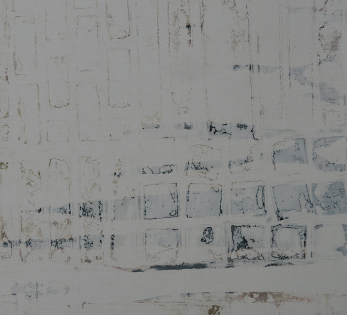
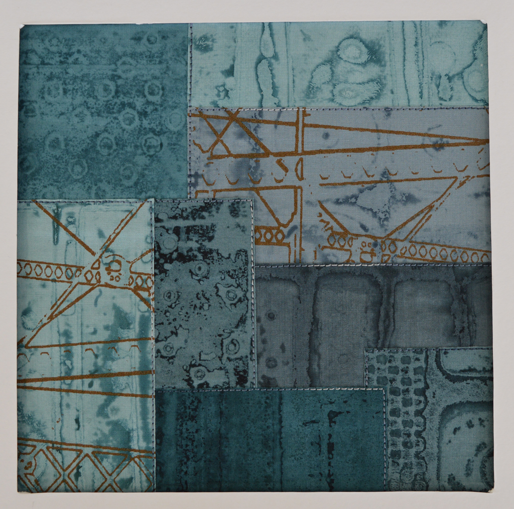
In my last post I shared the breakdown printing technique I use to put colour and texture onto my cloth. This series of work is inspired by industrial structures that once littered our landscape but now rarely exist outside of memories and museums. Their impact on the landscape has faded; has been built over. So for my cloth, having put down a layer of colour, I now strip most of that colour back off. Here is how.

14 Jan 2018 1.jpg
14 Jan 2018 2.jpg

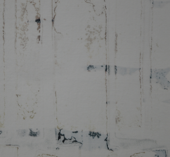
Using a steam iron I crumple and crease my fabric. I am trying to create an uneven surface that acts as a resist to the discharge solution. I use Formosol dissolved in warm water and apply with a 'dry' brush. I don't want to flood the cloth. I leave the cloth to dry overnight then use a steam iron to activate the Formosol and remove colour. This bit is rather noxious. Ideally you should use a gas mask but I find ironing near an open door with a stiff breeze is effective. I use the iron as a tool, selectively applying heat so that I get different levels of discharge. The 'black' dye I used to print the cloth is actually a blend of a blue-black dye and a dark brown dye. When I discharge the colour strips away to leave a yellowish brown that rather looks like a nicotine stain. 

Once I'm happy with the level of discharge I wash my fabrics at 60C and they are ready to use. Or not. Sometimes I over-do the discharge process and end up with a piece of fabric that is too pale. Sometimes the colour discharges to more of a red brown. In both cases I resist the temptation to throw them in the bin. Instead I add another layer of breakdown printing and another layer of discharge. 

Now you see it ...
30 Dec 2017 9.jpg

Some people get nervous about sharing their process / techniques. I don't. Mostly because I use methods that do not give exact, reproducible results. Every screen I pull is different. Although years of experience do direct my work it is the serendipitous nature of breakdown printing that makes each piece of fabric unique. 

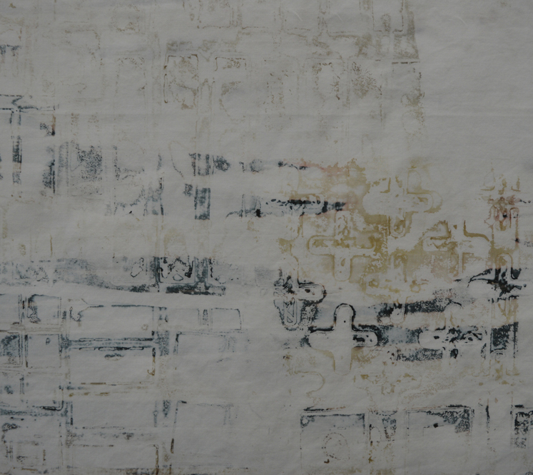
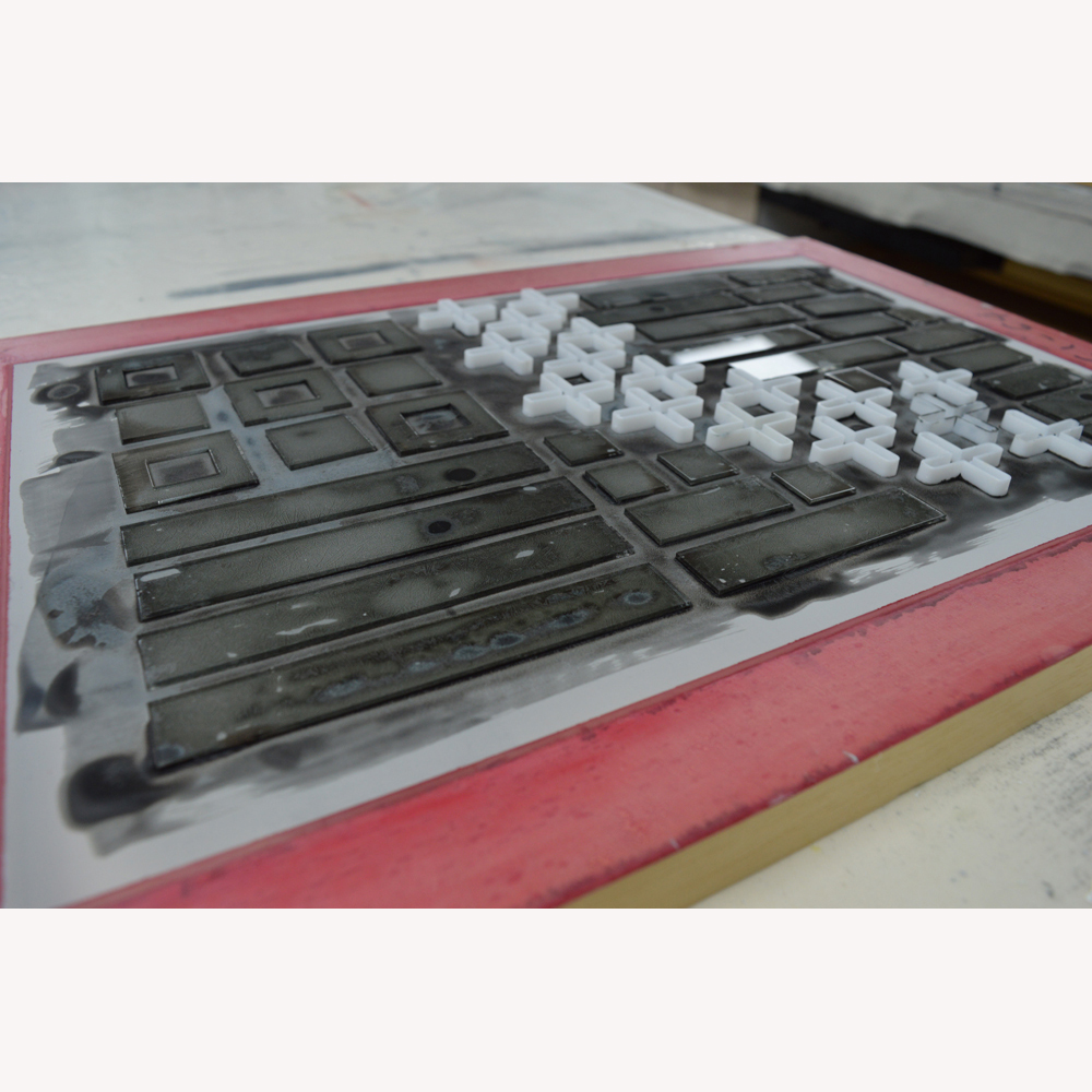
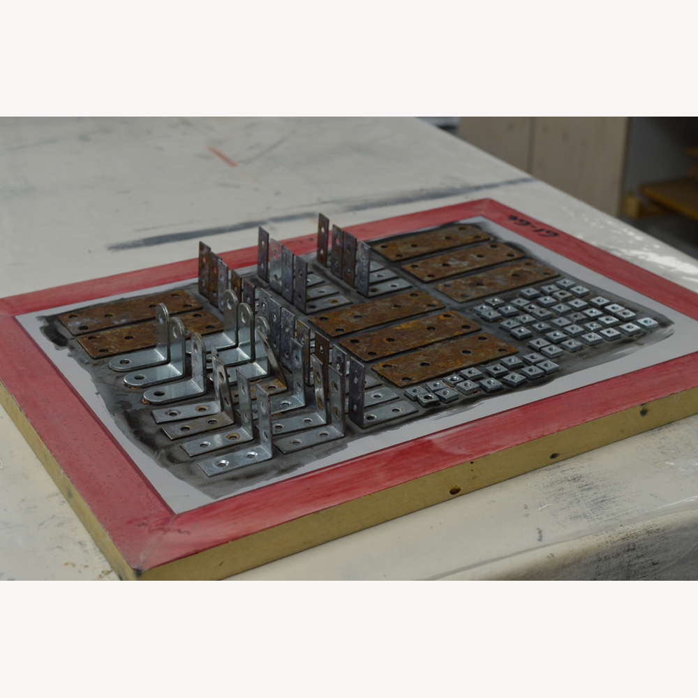
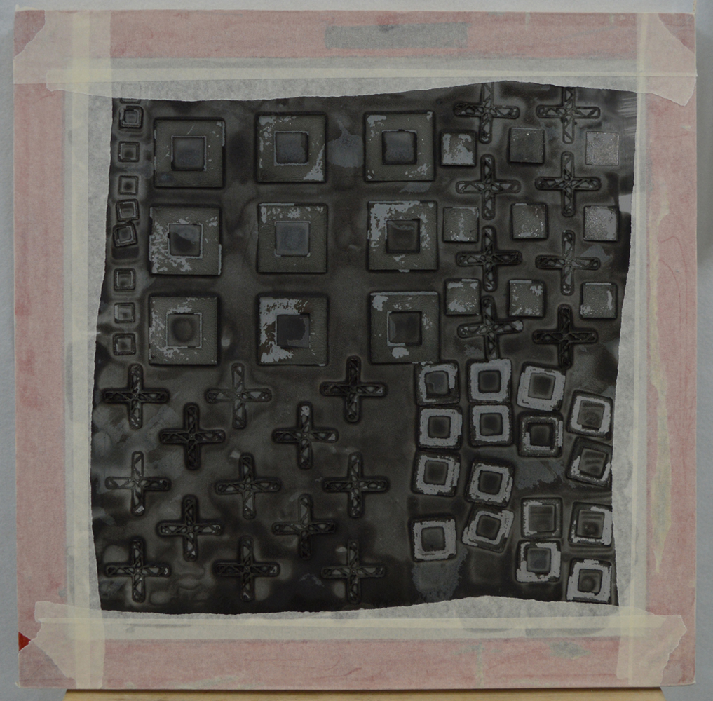
Over the last few weeks I have been printing fabrics for a series of work inspired by those industrial structures that no longer really exist - brick kilns, pit winding wheels for example. I have been printing in one colour - grey - but some of the fabrics have picked up traces of rust from some of the metal objects I use to make my screens. I start by adding a small amount of thickened dye to the back of a screen. I spread the dye using brushes, foam brushes or rollers but leave the coverage rather uneven. 

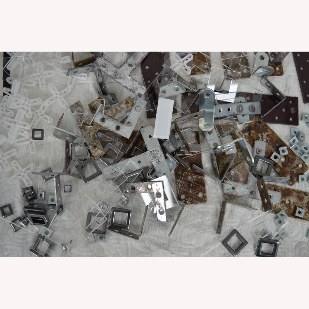
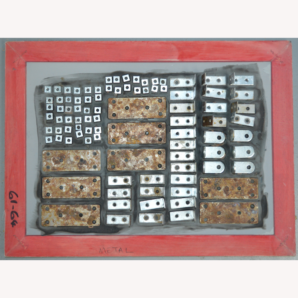
I then use my wonderful collection of 'things' to embed into the dye. I keep some screens specifically for use with metal brackets, buttons etc as over the years they have got rather rusty. 

I use different size screens but in the winter, when the screens have to dry indoors, I make sure to only use a thin layer of thickened dye and to use small screens. I would rather clean and make up more screens than pull a screen where the dye has flowed into blobs before drying. Fellow breakdown printers will know what I mean!

Once the screens are completely dry I take off the embedded objects. And yes, I wash them every time. Sometimes I print the screen as is. Other times I use torn masking tape to create wells around the screen. Using torn masking tape breaks up the edge of each print. Having pinned my white, soda soaked fabric to my print bench I print the screen using thickened paste. As I want pale, delicate marks I tend to dump out unused paste if it picks up dye from the screen and replace with fresh paste.

I aim to apply different patterns / textures across the cloth so don't have to worry about composition. Using multiple screens means that I don't get too much pattern repeat. I let the fabric become touch dry before rolling up in plastic and leaving overnight to fix the dye. The fabrics are then washed and dried ready for the next process.

Different but the same

It will come as no surprise when I say that 95%+ of the textiles I use in my work are created using breakdown printing.  Sometimes I include dyed pieces, sometimes I add a layer of print using thermofax but breakdown is my love.

For the last few years I have printed knowing that the majority of cloth is going to be cut into rectangles and used to build backgrounds for series like Ruins. Which means that I don't think about composition when making the screens. I may choose square type shapes to embed or keep things aligned in one direction. When I print the screens I tend to place the prints side by side until I have filled the piece of fabric. Again I'm not thinking about composition. I occasionally cut out a particularly lovely section of cloth to use to cover book board but mostly the cloth gets cut down and pieced.

I love this process and expect to be using it for years but I'm also keen to find new ways to use breakdown - I love experimenting. I've played with printing with both thickened dye and discharge paste before batching my cloth. I've played with multiple layers of colour on a screen. Both gave interesting results but didn't fit with what I was trying to achieve at the time.

And then I saw some images on Instagram by the lovely Leslie Morgan of Committed to Cloth / the Creative Studio and had a lightbulb moment. Leslie and her students were painting thickened dye on screens to give very defined shapes (often buildings) then experimenting with colour exchange when they printed off the dried screen. Wonderful stuff that got me thinking about positive and negative space and how I could use breakdown screens to create series of monoprints.

So I have been playing. And having so much fun. Watch this space ..

Topsy-turvy week

I have completed the first week of my 100 (week) day challenge. My goal is a steady 2 hours every weekday evening focussed on making small art with a commitment to finish at least one piece each week.
So I got one part right albeit the piece still needs stretching over canvas. Kiln 1 is a small piece in my Ruins series. I want to make art that has some relation to my upcoming exhibition at The World of Glass in St Helens. The museum has a dramatic entrance through a really large renovated kiln and St Helens is dotted with the remains of kilns, both glass kilns and brick kilns. The current Pilkington Glass factory in St Helens has some interesting buildings but brick built kilns are a thing of the past ... which fits in nicely with my Ruins series.

My hours this week though were not exactly steady. I nearly delayed starting my challenge because I knew I had an overnight trip with my day job this week. But then I thought what the heck ... I am never going to get a 20 week period without interuption. I'll be lucky to get a two week period. The import thing is that I work around interuptions. So here is my week:

  • Day 1 - 2 hours.
  • Day 2 - 40 minutes (I actually got out of bed early to work in the studio before heading off on my trip! This is a first for me).
  • Day 3 - 2 hours 20 minutes.
  • Day 4 - 3 hours (keeping busy until the election coverage started)
  • Day 5 - 2 hours

I'll admit to finding the 2 hours on Friday evening rather hard going as I had about three hours sleep before getting up for work at 6.30am. That coupled with the fact my husband joined me in the studio to carry one talking about the results meant that some of my stitched lines were not quite a uniform as I would like. Still I really like the result and am all fired up for next week!

As messy as it gets!

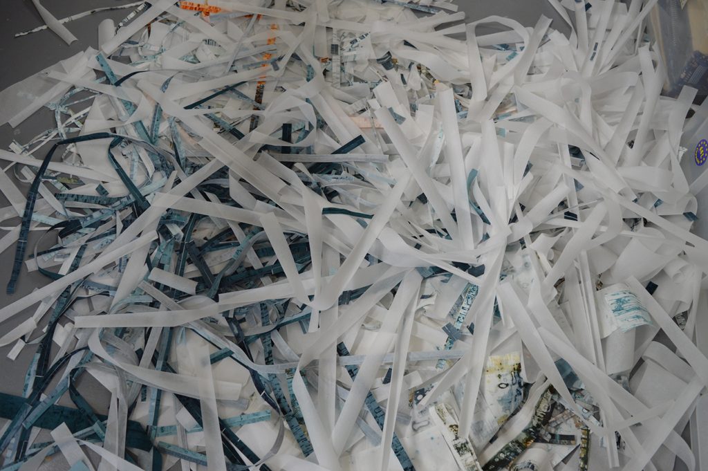
I recently posted that I can't created in chaos. And that messy in my studio is when there are snippets of thread and fabric on the floor. Well I got really, really messy (for me) over the long weekend we have just enjoyed in the UK. I also got sore feet from standing for hours. And my rotary cutter needed a long lie down in a dark room afterwards. But look what I got in return - trays of cut 'bricks' and bondaweb backed 'brickettes' ready to build backgrounds in my Ruins and my View series.

I love printing and it is so tempting to just keep on printing, especially on sunny days when breakdown screens dry quickly. But it is only by cutting up the fabrics that I can see if I have the right balance of colour and pattern. I can see that I have enough fabric to start making backgrounds. I use the bricks to piece backgrounds for my large quilts and I use the brickettes to fuse backgrounds for smaller works. But I can also see that I will need more of the darker fabrics in both series to complete the work I am planning for the rest of this year. Which means more printing. Happy days!

In the cold light of day

Knowing that I have two major exhibitions with Helen Conway in 2018 is amazing. Although I've worked in series for the last few years this will be the first time that I get to create a cohesive body of work knowing the pieces will be hung together. And knowing the spaces where they will hang. Yes Helen and I need to make sure that our work will work together in each space but otherwise the sky is the limit!
And we have well over a year to prepare. We will have about 15m each of wall at World of Glass and a massive 30m each at Stockport Wall Memorial Art Gallery. And we only have just over a year to prepare!! Thank goodness Stockport will be in the autumn.

My hope is to create two completely separate bodies of work albeit both stemming from three parallel series inspired by the urban and industrial landscape in and around both venues. But I have to also be realistic. I had an amazingly productive year in 2016 but my output still fell short of what I need to achieve in the next year or so. I blame my very loud and bossy 'voice'. It wants to work big. It insists on piecing lots of small pieces of fabric. And then it absolutely throws a tantrum if I don't complete the work with hundreds and hundreds of parallel lines of stitch. And, much to Helen's amusement, it even demands that I sew in all my ends.

Something has to change. I have to find a way to make smaller (and more affordable) works that I, but more importantly, my 'voice' can be happy with. So I have set aside the month of April to try new things. Can I make art that can be framed? Can I print onto paper? What happens if I print onto rough linen? Can I fuse my brick walls? Time will tell.

Find something you love

I make a mean lasagne. I could eat it every day but hate washing saucepans so guess what - I don't want to make lasagne every day. But I love all aspects of breakdown printing and I could very happily spend every day making beautiful fabric. I love mixing the dyes and preparing the screens. I love pinning out my cloth and pulling the screens. I even love washing my screens, washing the objects I use on my screens and washing my printed cloth. Because I love it I have spent hundreds of hours learning to  sort of control the outcomes and it now forms the foundation for all of my art. I made my first breakdown screens during a Committed to Cloth workshop in 2010. I wasn't really aiming for anything - I just picked a couple of colours and made two screens.

I printed the golden yellow screen first by pulling through with more golden yellow. I wasn't that impressed. Then I pulled the petrol green screen on top. I was worried that I had lost all the first layer. And then I washed the cloth and feel in love.

The joy of breakdown printing for me is in the detail. Those tiny areas of texture that are impossible to create in any other way. When I made that first piece of printed fabric into a piece of finished art I added stitch that mirrored some of that detail. Today I use breakdown in a very different way but thought you might like to see how I started!

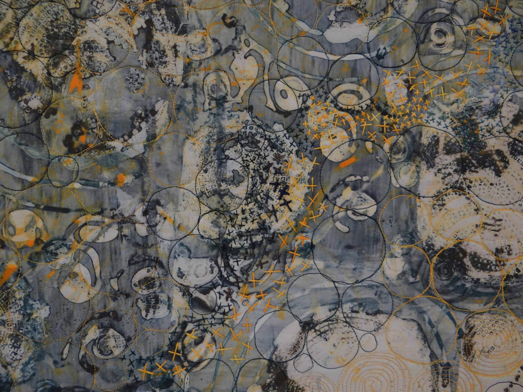
Knots and Crosses (detail)