Posts in Techniques
That wonderful tingly feeling

In my last post I talked about how creativity tends to creep up on me when I am immersed in process. I follow a set process when developing a new series ... I work on the colours first - pinning them on my design wall for assessment. Then I do the printing and pin pieces up until my design wall is covered. I discard fabric that doesn't 'fit' without thinking too hard about why. I then sample different types of construction. In my Hidden Message series this resulted in several pieces going in the bin before I was happy. With my Ruins series (and the series I am developing now) building a background made of bricks felt 'right'. Having stitched some small sample backgrounds I turn to my design wall again. I don't do sketchbooks - I do pinning things to a design wall until something 'clicks'.
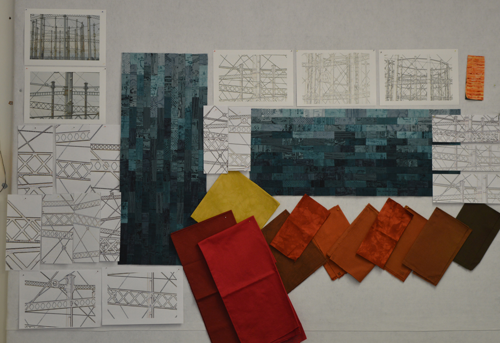
Today I pinned up my two sample backgrounds. I rummaged through my boxes of dyed fabric and pinned up a selection of colours. I am not going to decide yet if the foreground will consist of dyed fabric or printed fabric or stitch yet. They are just up there. I added a couple of photos I took last summer of an old gasworks.

Then I used one of my favourite 'tools' - I cropped and enlarged small sections from the photo and pinned the results up. And I got that wonderful tingly feeling! I don't know what size the finished pieces will be or how I will apply the foreground but I do know what I'm going to be spending the next few months doing.
Plan B .....

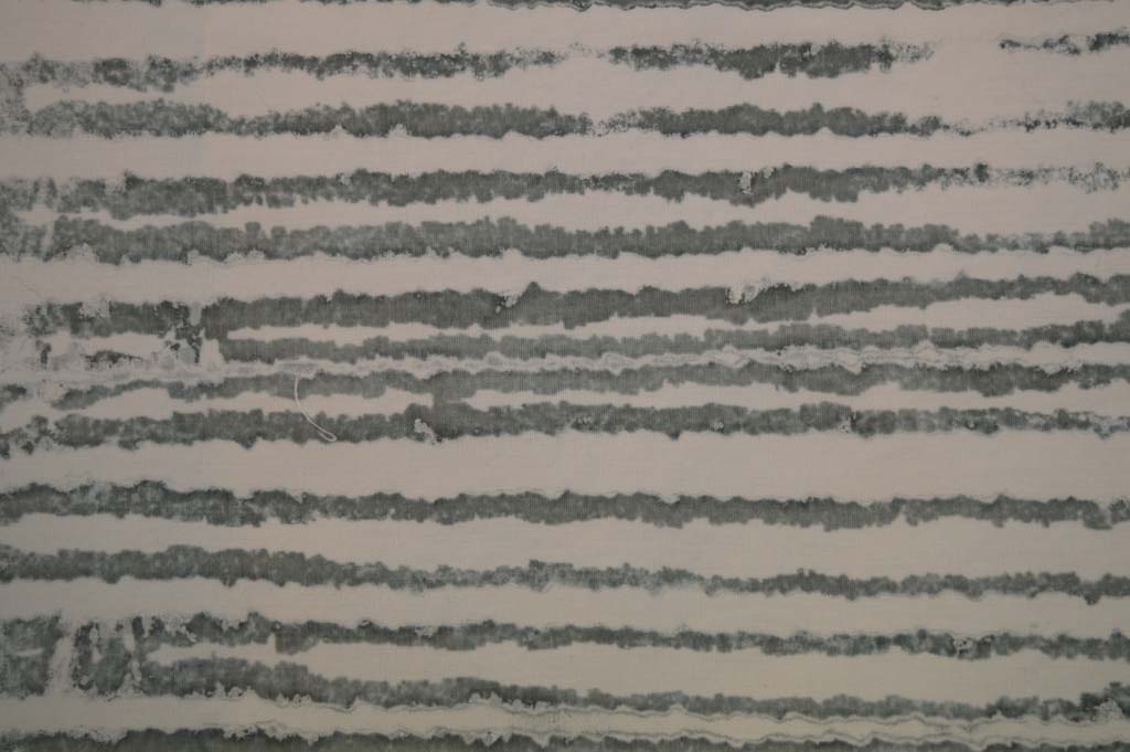
In between wrapping presents last week I did manage to prepare and pull some breakdown screens. I got some really promising marks by using a screen made with torn strips of freezer paper gently ironed onto the screen before rollering on a very thin layer of black thickened dye. I also made a screen using strips of torn masking tape. I wanted the marks to be delicate so pulled through with lots of print paste. And replaced the paste if it got tinted with colour.

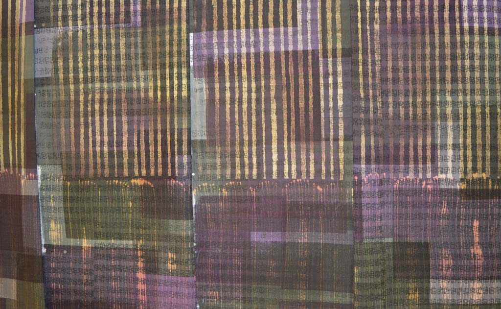
However those lovely marks only appeared from the first and sometimes second pull. After that everything went 'blobby' and not at all what I wanted.

I have found before that I get the best marks and the most 'pulls' when I dry breakdown screens outside on warm sunny days. Drying out screens quickly and thoroughly is not easy in the winter. I have tried drying this batch of screens next to and above radiators and I still only get one good pull. Trying to develop a new palette of textiles based on this low success rate could be really frustrating! Luckily I am not working to a deadline so, although Plan B looks to be a good one I am putting it on hold until spring. I wonder if Santa can bring me an early spring?

Failed beginnings

It is a good job that I have a Plan B as my experiments over the last week or so have failed to give me a 'WOW' moment. The results didn't even fall into the 'Ugly Duckling' category of pieces that might fit in with what I'm trying to achieve with some additional process. The experiment has been educational but not in any way that is connected with what I think I'm trying to achieve.
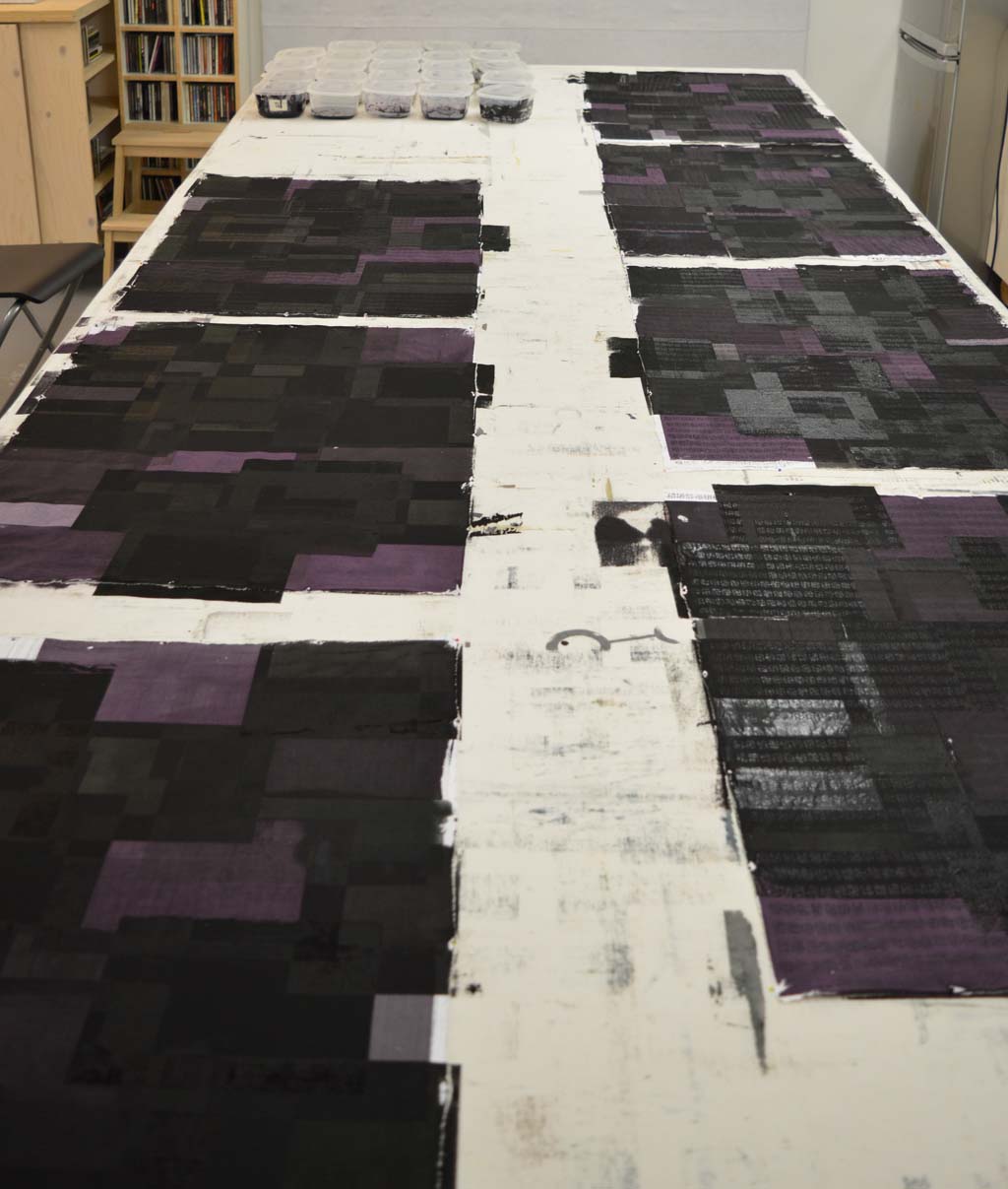
I started with 8 pieces of cotton each 'marked' with a different medium. It turns out that my water resistant acrylic ink didn't put up much of a fight and washed out when put in the soda bath to soak. The soda solution was a beautiful turquoise colour as I poured it down the drain. Luckily (sic) the colour washed out so sucessfully that I can reuse the piece of cloth. The remaining seven, soda soaked and dried pieces were pinned to the bench and a layer of colour added using an open silkscreen.

After batching them I washed and dried the pieces. The original marks were all clearly visible below the layer of colour. The lines I had made with dilute acrylic and with acrylic mixed with Golden Matt Medium looked a little faded and fuzzy but the rest appeared unchanged. I then stripped out the colour using two methods. One half of each piece of cloth was discharged using Formosol mixed with print paste and applied through a screen. The other half was discharged using the cheapest bleach I could find (40p for 2 litres - bargain!) and a fan brush.

The Formosol discharged to a fairly consistent colour irrespective of the original colour. The bleach gave a bit more variation and also some different colours. Neither method affected the original marks. Hmm ... I had been hoping for some really interesting chemistry to happen that maybe striped back or somehow changed the first layer of marks. Instead discharging added colours to the fabric pieces that created a palette that reminded me of street lights glowing in the dark. Which has got me thinking about something else ... maybe the beginning of something else? So the pieces will be hung on a small design wall to contemplate whilst I move on to Plan B!

Take one blank canvas ....


Having worked on the colour family for what I hope will be my new series I need to start creating a palette of fabrics. Where to start? I started by clearing a design wall and moving everything off my 3.5m long print table. I don't do sketchbooks so this is my equivalent of that blank first page. Scary.

Time for a cup of coffee and a think. I want to experiment with building layers. Marks or text being the first layer. Colour (from the new colourway) being the second layer. Then marks or text being etched back into the colour using a discharge process. Thus revealing some of the original marks or text. Sounds simple but there are so many ways of achieving this. Being a list person I went through all my cupboards and pulled out all the different materials that could be used to mark cloth and wrote a long list of all the different ways they could be used - for example using acrylic, acrylic mixed with water, acrylic mixed with fabric medium, acrylic mixed with matt medium ... you get the picture. I cut decent sized pieces of cotton, pinned them to the bench and started.

Having not touched some of the materials in years I guess that I shouldn't have been surprised by how much stuff had dried out and how many containers I could only get into by cutting off the lid! My big long list got a lot shorter!

I am not bothered about the types of marks or even the colour of the marks as I'm pretty sure that most of what I produce over the next few weeks will end up in the bin. I am really looking at how different materials interact. After a pleasant couple of hours I have my first set of 8 different starting layers. Some will need fixing which I will do tomorrow then they will need soda soaking and drying ready for the second layer. It wasn't so scary after all.

Artist interrupted

One of the things I like about my new day job is that there is less travelling and generally more 'regular' hours. I will have more time in the studio and be better able to plan my output.
But this week I have had a couple of very long days and on Saturday I fly out to the US for a week. So my plan to work at the bench breakdown printing with my new colourway is on hold. I print using thickened procion dyes on cotton so I could leave the printed pieces rolled up in plastic for weeks before I wash them out but I prefer to get in a rhythm of printing, washing / drying, assessing then printing. Don't ask my why but the first piece of fabric I print after a period away from the bench is always disappointing and often butt ugly!

Instead I have spent my few hours in the studio this week working on my piece for the SAQA call Made in Europe. All the 'construction' work is complete and I am now stitching lots and lots of parallel lines. If you look closely above you will see that I keep my lines straight by using my walking foot as a guide and placing masking tape strips about 1 inch apart. I may not be in complete control of my schedule but boy do I control those lines!

Happy with the colours, now time to get printing

New 24 piece colour family After multiple attempts I am now happy with my new colour family. I am calling it 'traces' as I'm hoping to use it to create a new body of work based on iconic industrial buildings that no longer exist. I spent my childhood summers staying with my grandparents in a small village north of Nottingham. The area was criss-crossed with coal seams and every journey took us past pit heads. These buildings don't exist anymore but I bet most people my age who spent time in the north of England know exactly what I am thinking off.
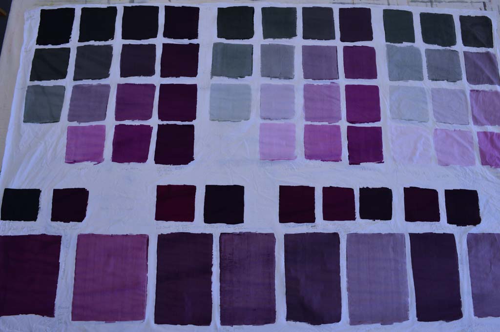
I used magenta dye as one of the starting colours as an ironic reference to the way we tend to look at the past through 'rose tinted glasses'. Although many people mourned the loss of community when the coal industry declined I don't think anybody could remember working conditions in the pits or the polution in the surrounding areas through rose tinted glasses hence I have blended the magenta with black to the point where the colour just tips over from pink to purple. I particularly like the paler colours in the family.

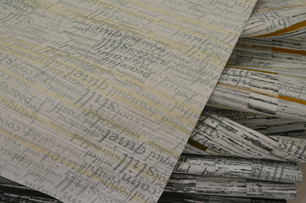
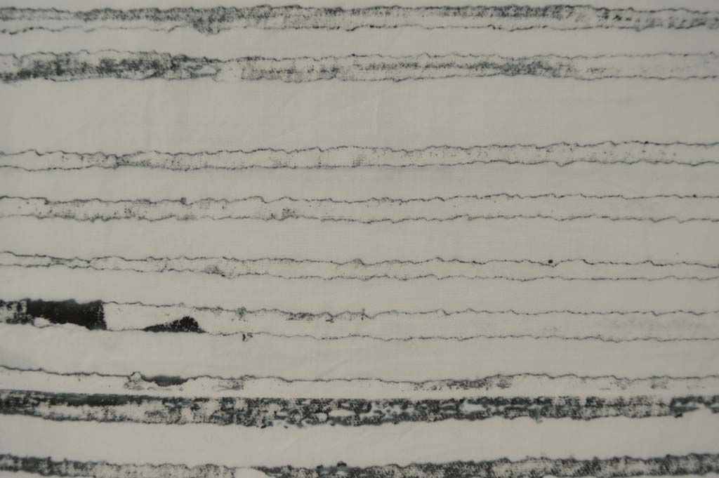
Now that the colour family is fixed I've started work on creating the palette of fabrics. This could take several months as my ideas tend to evolve gradually as I work at the bench. However the way I used breakdown printing in my Still / Storm series gave results that were similar to what I have in mind for this new series. So this is where I'm starting.

Fragile lines created by breakdown printing


Pretty in Pink?

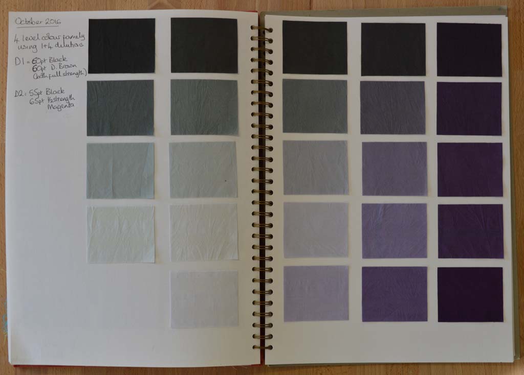
Using thickened dyes to create new colour families I've written about colour families before. I learnt about them on a wonderful class with Leslie Morgan. Essentially a colour family is created when you cross mix a dark, medium and light shade of two base colours. You can dye colour families or you can blend them using thickened dyes. My Hidden Message series used a dyed colour family because I wanted to create a collection of cloth with flat colours that I could then print on top of. The fabrics I used in my Ruins series were mostly breakdown printed using a colour family of thickened dyes.

The BIG IDEA that is rattling around my head will also feature breakdown printing so I have been making colour families using thickened dyes. I have already decided that one of my base colours will be a neutral black. And because I record everything I do I know how to make it with a mixture of black and dark brown. (The black dye I buy from Kemtex is actually a very, very dark blue so it needs the addition of brown to balance it).

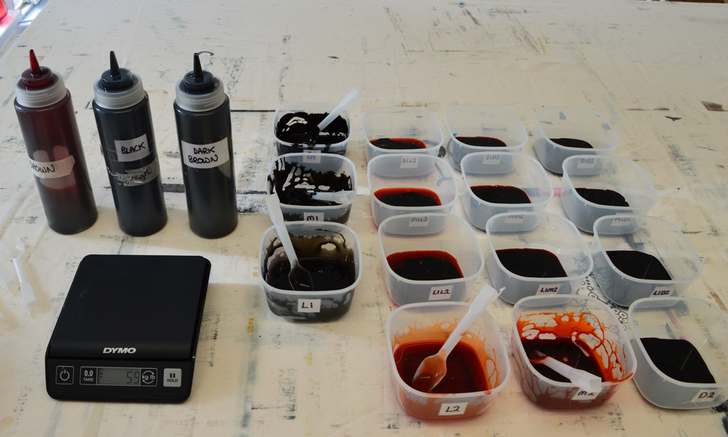
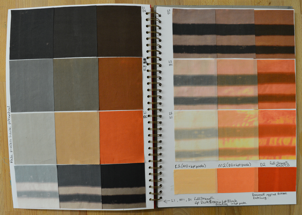
But my idea for my second base colour was a little vague. So my first step was too blend different amounts of magenta with black and then to blend a 50/50 mix of that with my neutral black ... sounds a little confusing but I keep notes as I go. I then auditioned this 50/50 mix by diluting it with print paste to see what lighter shades would look like. I also decided to see how each of the colours would change if discharged with a thickened Formosol paste. As you can see my first attempts were very definitely still pink.

I liked the look of my fourth attempt (above, right) so then blended a full 15 piece colour family. I only needed very small amounts of each colour which is why I have a set of scales that measure to the gram! Again I discharged areas of each colour swatch.

And because my BIG IDEA is going to use very pale versions of the colour family I created an extended colour family by cross blending medium, light and very light shades of my neutral black with medium, light, very light and very very light shades of my second base colour. There are some wonderful greys here and this is definitely a very pretty colour family. But, having washed, dried, ironed, cut out swatches and put them into my sketchbook I still think it is too pink! Back to the bench Leah!

Back before the bench

I have a confession to make - I have let 'being kind to myself' because I started a new day job 5 weeks ago slide into procrastination. Now I don't mind 'value added' procrastination such as deep cleaning the studio before starting a new project. But I have been guilty of non-value added procrastination .... did I really, really need to finish watching all those Walking Dead boxed sets? Hmm - probably not! Mixing a new colour family

So how am I going to get back into a good studio habit? I'm going to do one of those things that I love most of all. I am going to develop new colour families. I have had a BIG IDEA brewing for a while and have decided that now is the time to start working on it. Inevitably (as with the colour family I mixed this week) I will waste quite a lot of dye and cloth before I get something that replicates the colours in my head. However I always keep good records of everything I mix so, in one sense, nothing is wasted. And yes I always uses scales to make sure my colour families are reproducible.

Colour family made with a 60/40 Dark Brown/Black blend and Rust. Each colour was also discharged using Formosol.

Photographing my work (again)

Happy today? (detail) When I needed to photograph a really big Ruins piece in August I ended up borrowing a studio and some lighting. (The design walls in my wonderful studio just weren't big enough.) And whilst I was happy with the result it was a lot of effort to 'book' the studio, transport the quilt etc. So, with help from son Cal, I have built a system that will allow me to photograph big pieces and 3D pieces in the comfort of my own studio. Just in time to photograph my latest piece 'Happy today?' which is a double sided long thin piece designed to hang from the ceiling and pleat onto the floor.

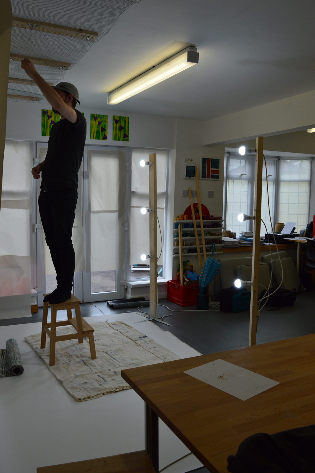
We brought a 2.7m wide roll of photographic backdrop paper which sits on a narrow shelf built onto one of the long beams in the studio. This allows me to drop the paper down and along the floor. We brought a roll of metal mesh and used wood battens to fit a length to the ceiling in front of the backdrop roll. In the photo below Cal is using picture hooks and nylon hanging thread to suspend the quilt about 30cm in front of the backdrop. Cal made me two lighting stands. Each is a 6ft length of timber with four 10inch shelf brackets attached to the base to provide stability. He drilled out 3 holes on each upright through which he has attached regular bayonet light fittings. Having inherited my 'tidy' gene Cal put a junction box on each upfright so that each is run off a single plug. We used six non-directional cool white light bulbs to gave lots of good light although I need to invest in a better way of cutting the light from the french doors as this gave us a bit of problem with shadows.

Once we had finished photographing the piece we rolled up the paper and stored the lighting stands. (And moved tables, chairs and print benches back in place!). We have already decided that the system could be improved. Sometime before I use it again we need to get a 2.8m wood or metal pole to hang the roll of backdrop paper from so that it drops without any distortion. We need to replace the wire mesh with something more heavy duty especially if I want to photograph bigger, heavier pieces. And we need to paint everything white so that it looks nicer! Well maybe 'need' is a bit of an exaggeration but I do have the 'tidy' gene!