Posts in Colour
Available now - Colour Your Palette
Colour Your Palette front cover for website.jpg

You can now pre-order my new book ‘Colour Your Palette’ via my on line shop. The book costs £25 (+ postage) and I expect to start shipping globally from the 10th November.

Colour Your Palette is a practical guide to understanding and using colour when specifically working with Procion MX dyes. But the principle behind the book, and the exercises it contains, could equally apply to other dye types. I have attempted to translate traditional colour theory, based on paints and paint pigments, into colour practice when using dyes. Because dyes do not behave like paints. Dyes are not a surface application where the colour is ‘stuck’ to the surface like paint on paper. Dyes penetrate right into our fabrics, our yarns, our fibres, and our threads reacting with them chemically at a molecular level. They don’t make our fabric stuff and they don’t fade when washed. Dyes are translucent - we can print or dye our textiles multiple times adding layers of texture and shape. But they do come with some limitations that mean the ‘rules’ for mixing colours when using paint are not the same as the ‘rules’ for mixing colours when using dyes.

Colour Your Palette is a ‘big’ book at 216 pages but my aim, in writing it, was to provide a guide that helps you achieve the results that you want time and time again. A guide that gives you all the information you need to create colours that make your heart sing!

To coincide with the launch of my new book I have added a selection of new products to my website. In addition to all the dyes and other chemicals I am now selling three sizes of screen (for screen printing), wide necked squeezy bottles (for storing thickened dyes) and acrylic mixing plates (for mixing small quantities of thickened dyes, mono-printing and so much more). And I have put together a range of Starter Packs with a 15% discount on the cost of the individual items. I’ll talk about these more in the coming days.

I have also added some new Wonky Print Inspiration Packs of my own printed and dyed fabrics.

And, just to remind you, I will be donating £1 for every copy of Colour Your Palette sold between the 1st and 10th November to The Trussell Trust, supporting food banks throughout the UK.

Thank you, and stay well, Leah x

PS. I have scheduled this post, and all the new products, to become public at one minute past midnight on the 1st …… or at least I think I have!

1 November 2020 1.jpg
Let the teasing begin!
Making_23.jpg

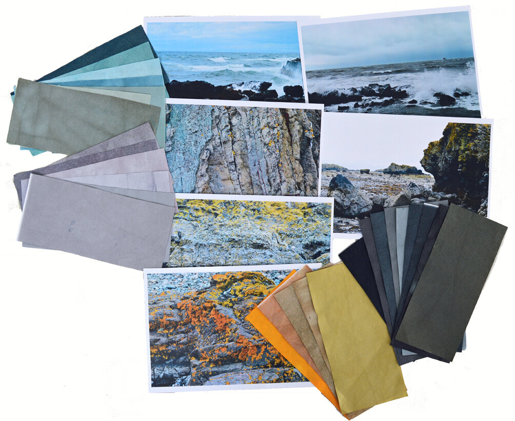
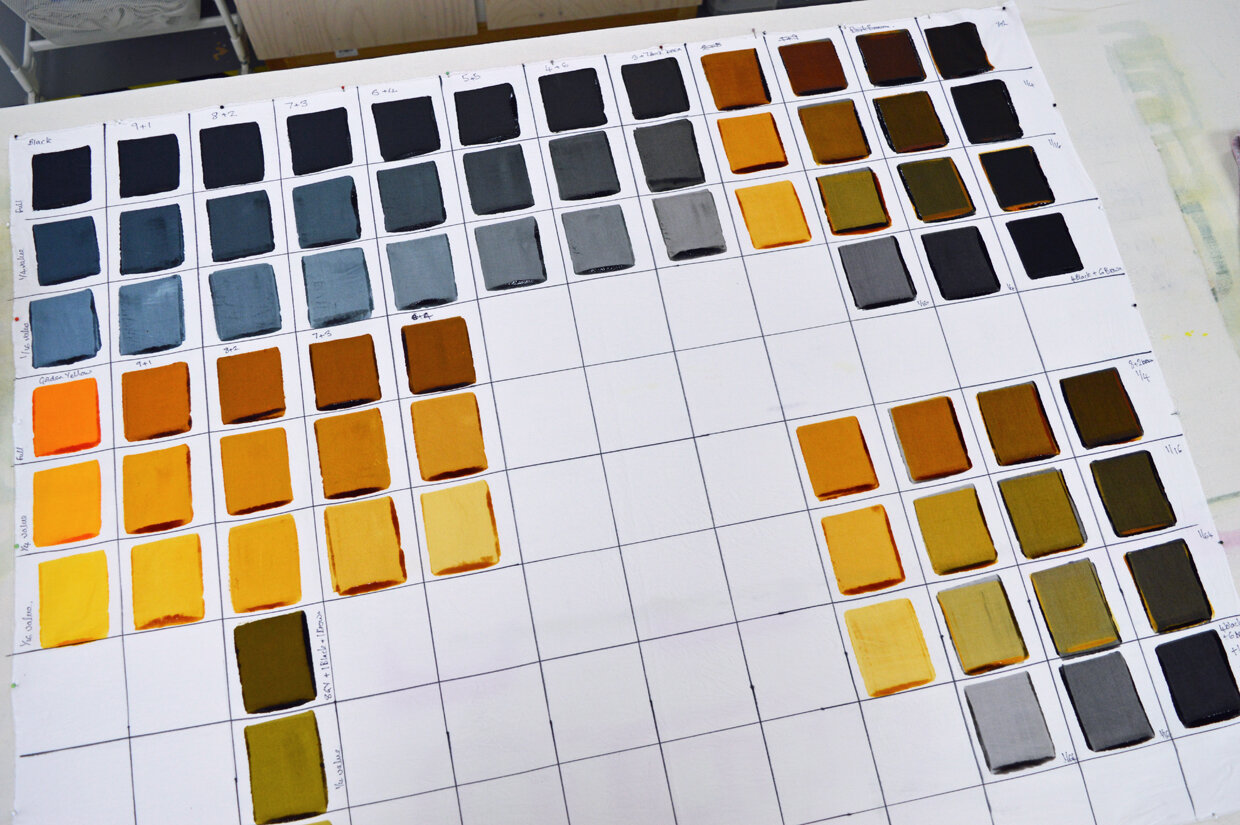
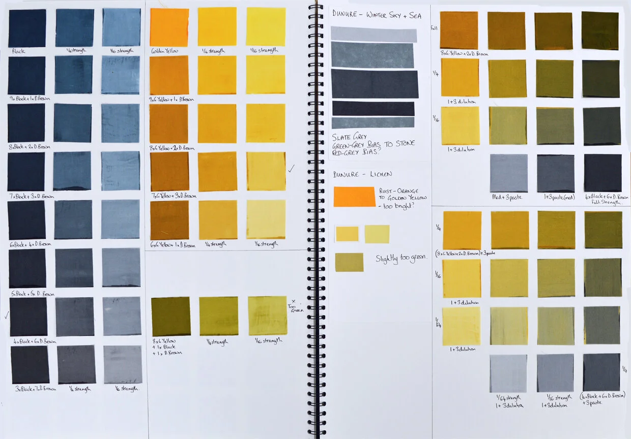
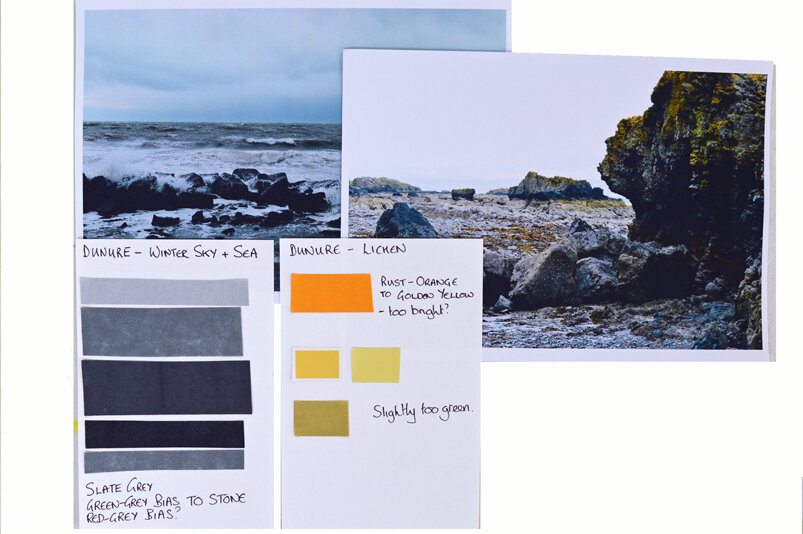
In one section of my upcoming new book I look at how we might extract palettes of colours from a range of different sources of colour inspiration. When developing colours for new projects I sometimes jump straight in, mixing and playing with thickened dyes straight onto my fabric. At other times I need something to get me started, and a simple paper exercise can be just the thing I need to help focus my ideas.

The image above is my (current) collection of Colour Catchers. Colour Catchers are the paper-like laundry aids that prevent colours bleeding. I use them whenever I’m washing freshly dyed or printed fabrics. They capture any stray dye and are brilliant! I snip pieces from them when carrying out a colour study but many people use them in mixed media projects or as a base for embroidery.

Below are images from one of the worked examples in the book …… my starting point was a collection of photos of the beach at Dunure, Scotland, my second favourite place in the world after my studio!

Colour Your Palette will be available to pre-order on my website from the 1st November with shipping expected to start before the 10th November. I am so excited!


Colour Your Palette is nearly here!
16 October 2020 1.jpg

I am so very excited that my second book, called ‘Colour Your Palette’ is close to completion. It has been a bit of a slog but I’m just a few more hours work away from sending it to the printers for a ‘proof’ copy so that I can check the colours of the images (all 340 of them!).

It is a book about colour. In it I translate colour theory, which is nearly all written about paints, into colour practice for people, like me, who use dyes to add colour to fabric, thread, yarn etc. Dyes do not behave like paints. They come with some limitations but those limitations are far outweighed by the potential dyes give us to build up layers of colour, mark and shape on our cloth. And they are wash fast!

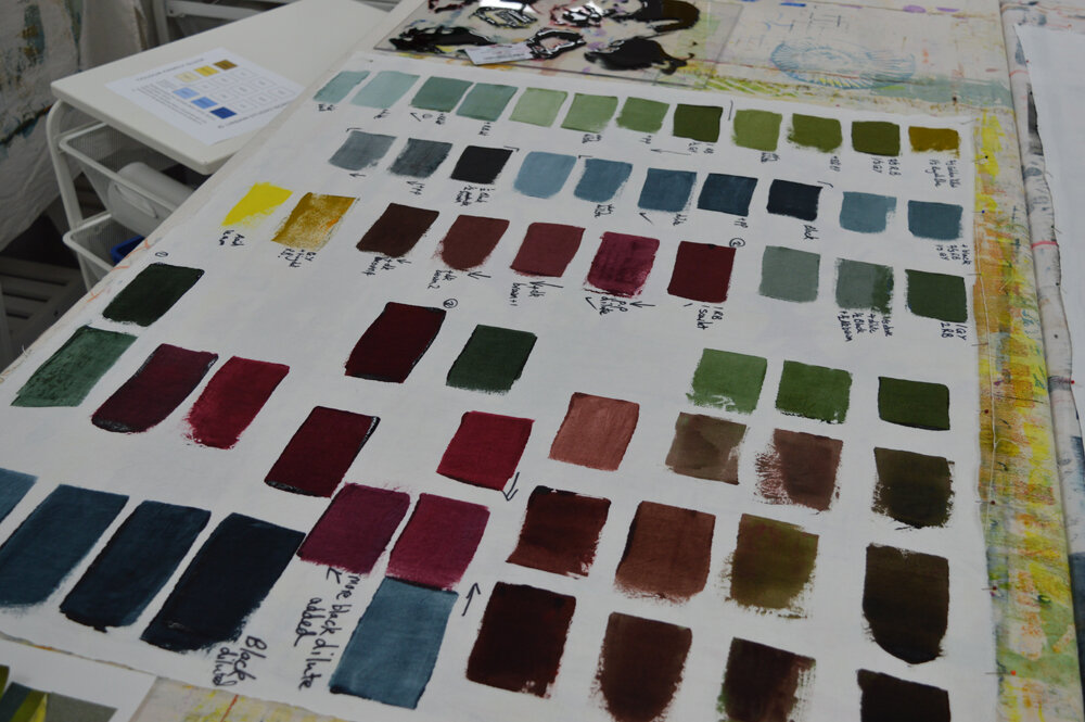
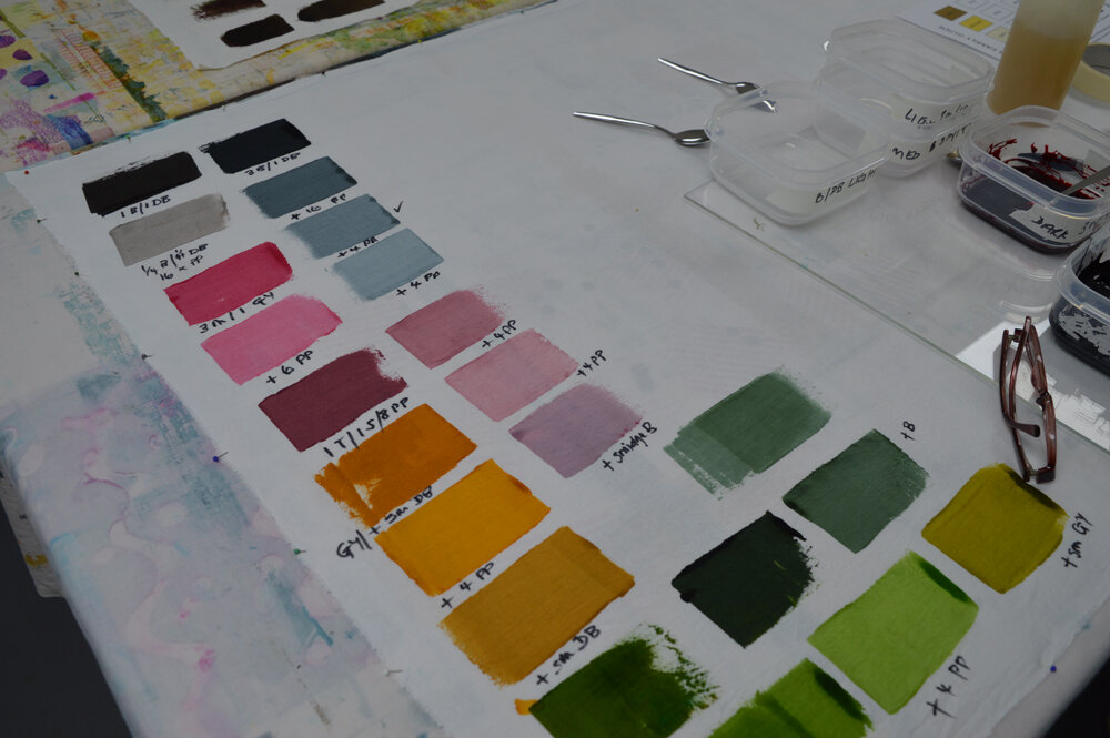
I take the reader through the creation of a series of colour references that teach us how a huge number of colours can be mixed from a starting set of eight base colours, how the order in which we layer our colours matters, how different fabrics take colour differently and how you can accurately match or reproduce colour irrespective of whether you are using thickened dyes to screen print or powdered dyes to dye fabric in a bucket.

I look at different colour schemes and guide the reader through a series of colour studies which look at different ways collections, or palettes, of colours can be derived from different types of colour inspiration. Although this isn’t a book that focusses on lots of different techniques for adding colour to cloth I do include a section on the tried and tested methods I use in my art and that I teach in my studio. This has turned out to be a big book, over 200 pages! ! I’ll tease you with more details over the coming weeks.

Colour Your Palette will cost £25 + shipping. After a lot of thought I have decided to make it available for pre-order from the 1st November with the first books expected to ship on 10th November (or earlier!). Sometimes pre-order means a discount but I’ve decided (on your behalf!) to donate £1 for each book ordered between the 1st and 10th November to The Trussell Trust, a UK charity that runs food banks and campaigns against food poverty. Since the beginning of the pandemic you guys have helped raise over £400 by buying my charity bookmarks. It would be nice to increase that in the run up to Christmas.

I’m so excited! And just a little bit tired ……

Leah x

Blahhhhhhh! What was I thinking?
clipart1500648.jpg

So ‘the book’. Yes it is still too soon for me to reveal all but I can tell you that it is a more complex beast than Breakdown Your Palette. It has a broader subject and, whilst there are lots of ‘instructional’ bits, there are also lots more ‘wordy’ bits. Bits that require me to strung together coherent sentences and even coherent paragraphs. Bits that require a plentiful supply of coffee, biscuits and chocolate. (I save the gin for really bad days). Bits that some days get the better of me. Darn those bits!

There are definitely days when I wonder how I managed to finish my first book and what on earth possessed me to start a second. Let alone one that is about … nope, it is still too soon.

On the plus side though I have the perfect excuse for walking away from my computer. Samples. Dyeing samples. Printing samples. Constructing samples. Photographing samples. Surrounding myself with lovely, lovely colour. I’m just hoping that I can extract all the wordy stuff out of my head and into my computer before I run out of samples to make! There are only so many hours a day that I can bang me head on my desk. I’m also hoping that I can remember how to use InDesign as I haven’t opened the software since I finished the breakdown book 17 months ago. I suspect there will be even more coffee, biscuits and chocolate (and gin) needed.

I love it really. And I think I can tease you with a couple of shots of my studio and my design wall taken this week ….

21 June 2021 2.jpg
21 June 2021.jpg
Colour!
Single vs multipigment test 2 thumbnail.jpg

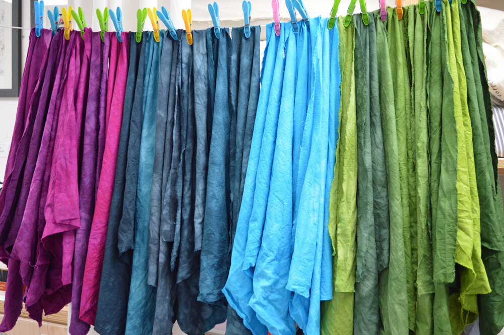
I may have been quiet on social media for the last couple of weeks but I have been busy in the studio working on my next book. The world outside is still an upsetting mess but life in the studio has been a calm, colour filled oasis of gentle productivity. There is still a very long way to go but I have been playing with my Procion MX dyes. Exploring them individually, mixing them to create hundreds of new colours and dyeing fabric. Life feels good.

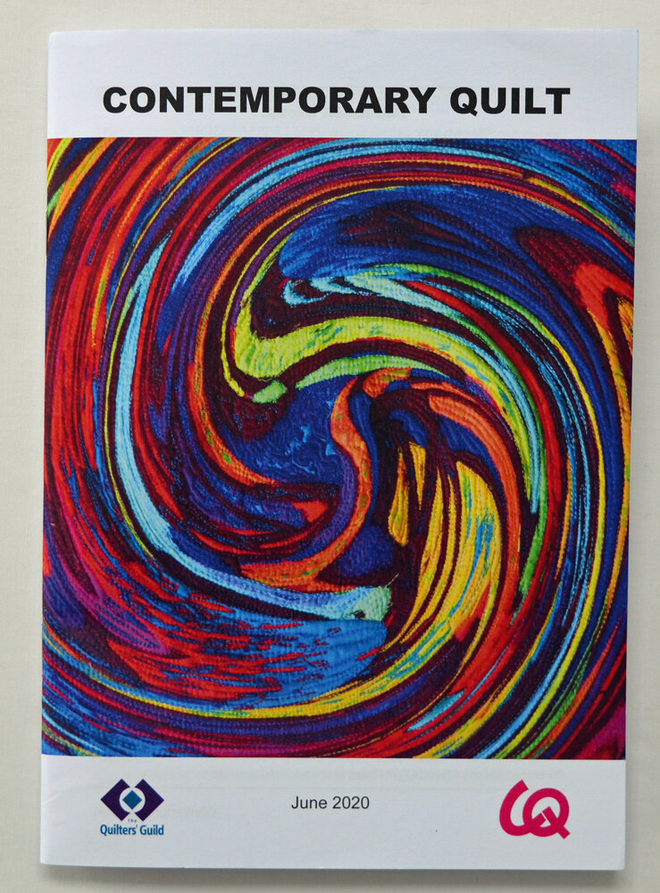
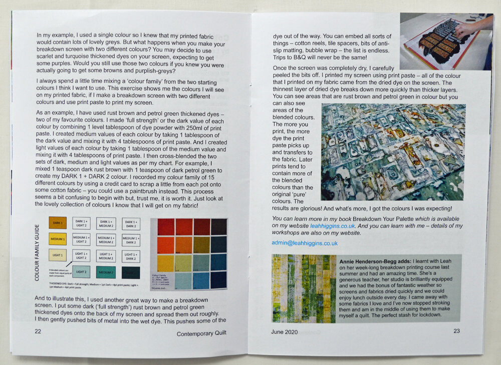
I was also delighted to receive my copy of the Contemporary Quilt newsletter. It is a special addition focused on the theme of colour and I’m proud to have written one of the articles entitled Colour and Breakdown Printing. The front cover is from the very talented Alicia Merrett. Maggie Jarman and Annie Henderson-Begg have done a splendid job under difficult circumstances and it is much appreciated …. receiving the newsletter through the post felt like a return to normal. Even if we all know that normal is going to be different.

Stay well, Leah

Colour!
10 February 2020 4.jpg

Last weekend I had a new group of Creative Surface Design students in the studio which was wonderful as we spend the first weekend of this course focusing on colour. Colour blending, colour exchanges, colour families ….. I love it!

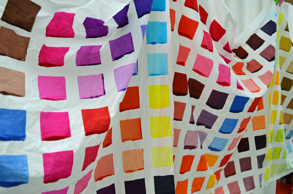
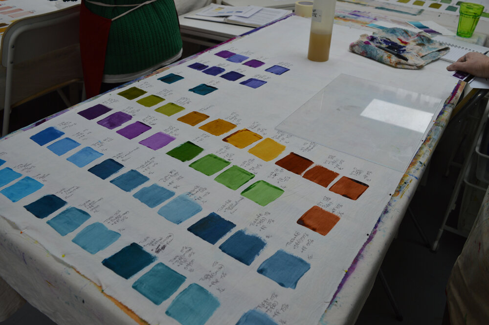
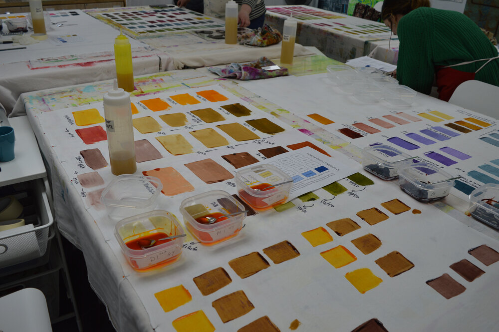
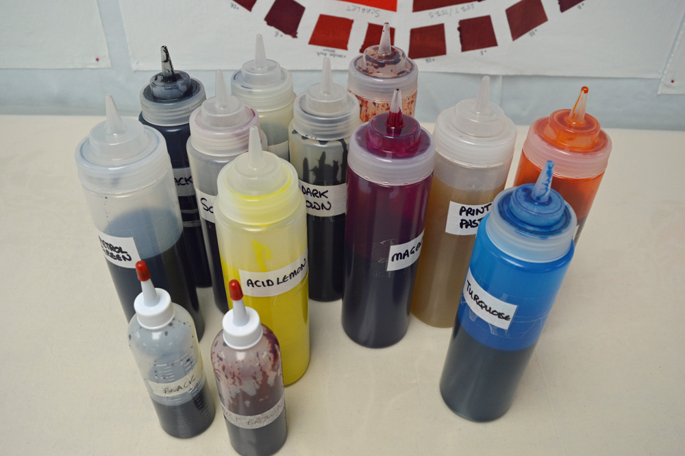
Although you can buy Procion MX dyes in 40 - 50 diffferent colours in the UK I only keep 10 colours in my studio - acid lemon, golden yellow, magenta, scarlet, turquoise, royal blue, black, dark brown, rust brown and petrol green. I could blend rust brown and petrol green myself but buy them pre-blended as I use a lot of them in my own work. The remaining 8 colours I often refer to as my ‘primaries’ - OK they are not all technically primary colours but I use the word to mean a set of colours from which you can blend any colour that you might want. I guess I could call them ‘base’ colours or ‘starting’ colours but the word doesn’t matter. What matters is understanding how they interact as you combine them. For example if you want a vibrant violet purple you need to use magenta as your ‘red’. If you use scarlet as your ‘red’ you will get very frustrated as, when blended with either of my blues (turquoise or royal blue) you will get browny purples not vibrant violets. I love the ohhs and ahhs I get from my students when they understand this and discover how to blend the colours they want. It is so important if you want to control your outcomes when you print with multiple colours of thickened dye.

One of these days I will put together a 5 day workshop on colour but for now here is yet more eye candy courtesy of Amanda, Lesley, Barbara, Tracey, Anna and Cat.

Print, Stitch, Go!
Leah 1.jpg

A couple of weeks ago I taught my Print, Stitch, Go! workshop for the first time. I was rather nervous. The first half of the workshop was spent printing and dyeing fabrics but the second half was all about using those fabrics. Printing, dyeing, splashing about lots of colour is my comfort zone so no problems there. But my approach to using my own printed and dyed fabrics is to keep it simple and let the fabric do the talking. Which is my way of admitting that I just use squares, rectangles and simple strips. I couldn’t get points to match in a mariners compass in a month of Sundays!

Thankfully my lovely students embraced squares, rectangles and simple strips! Phew!

The workshop went really well. The first two days were busy and hectic with printed fabric hanging everywhere. Wednesday was change over day when we washed and ironed our fabrics, converted the studio from a ‘wet’ to a ‘dry’ space and started to decide how to use our fabrics. And the last two days were just lovely. Calmer, but just as filled with colour. Lots of mutual support. Lots of ohhs and ahhs. Great company, amazing work - thank you Barbara, Bernice, Michelle, Sally and Sue.

So here is some eye candy …..

From left: Bernice Hopper, Michelle Barnard and Sally Taylor

From top: Barbara Logan, Sue Morgan and Bernice Hopper

And here's a post that I should have been writing six weeks ago ... Contemporary Quilt Summer School
20190928_165353 blog.jpg

I had a wonderful time teaching at this years Contemporary Quilt Summer School at the Hillscourt Hotel near Birmingham. I taught a class called ‘Colour, Colour, Colour!’ in which students learnt how to blend colours from a set of primaries, how to create a colour families from their source of inspiration, how to dye a colour family and how to use screens and thermofax screens to print a couple of pieces of fabric in the same colour family. Not bad for a conference venue that had carpet on the floor, fancy desks instead of useful tables and whose only sink was in a small kitchen one floor down. I do love a challenge!

The students had different levels of understanding of colour theory and knowledge of dyeing / printing but hopefully they all came away knowing something new. They certainly liked my colour wheels! There were 14 students and they each developed a unique colour family. The room was full of colour!

I took lots of photos and was intending to write a post whilst everything was fresh in my mind. But, well stuff happened and I can’t remember clearly who did what so instead they can all take the credit for some wonderful eye candy. Thank you Stella, Frances, Jane, Pat, Alison, Jenny, Liz, Sonia, Sarah, Elizabeth, Marion, Ann, Glenys and Hazel.

Sampling for others

Whatever I have done in life I have always tried to do well; to be the best that I can possibly be. Now I recognise that there are lots of things that I’m never going to be any good at (foreign languages, clean manicured hands, nurturing plants ….) but that’s OK because they are not important to me. However teaching in my studio is important to me so I am striving to be the best that I can be.

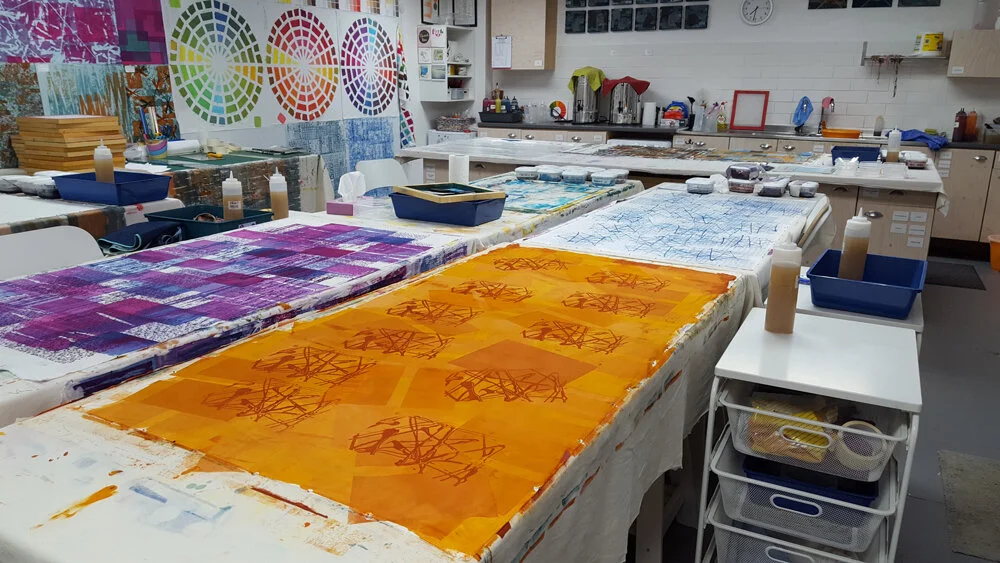
I have worked hard to organise and equip my studio so that my students have lots of space to work and so that they don’t have to bring masses of stuff with them. I have had great fun making colour wheels to help and guide my students. And I’ve worked through my lesson plans to make sure I have lots of relevant (and hopefully inspiring) samples. But I realised whilst I was at the Knitting and Stitching Show last weekend that I don’t have enough breakdown printing samples. Don’t get me wrong, I have metres and metres of fabric printed ready for the art I need to make for my solo gallery at next years Festival of Quilts but those fabrics are in ‘my’ colours and have been made using breakdown techniques that fit in with my personal inspirations.

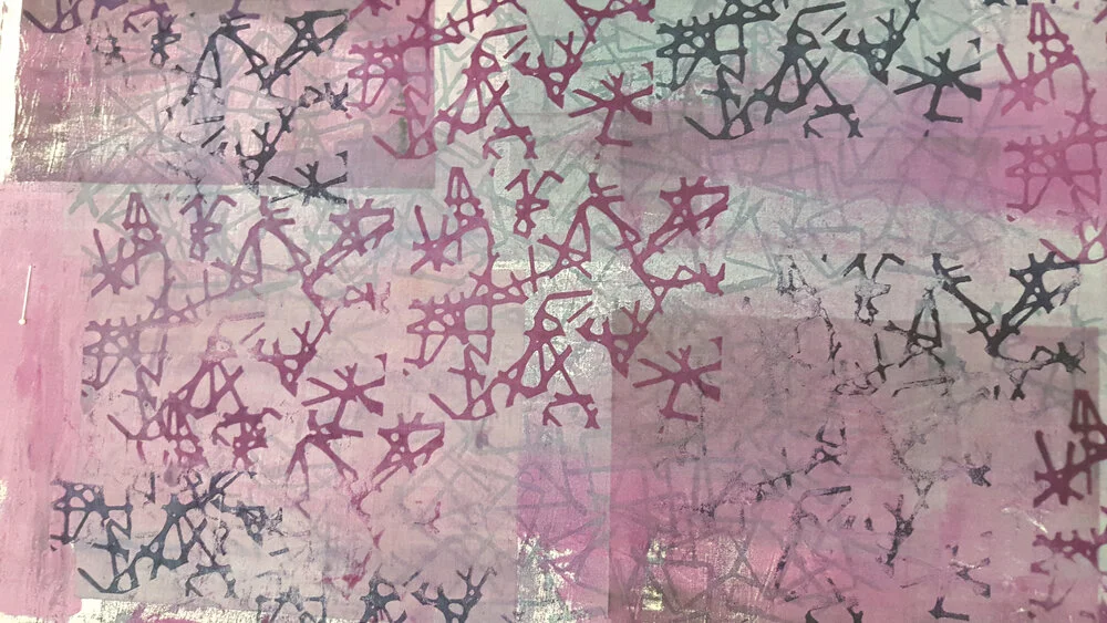
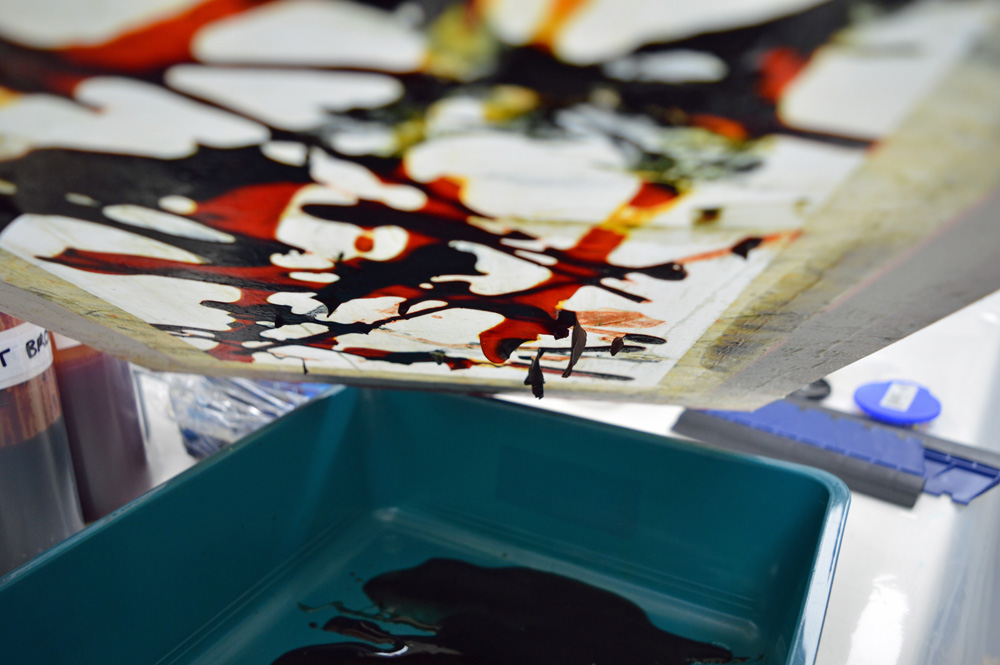
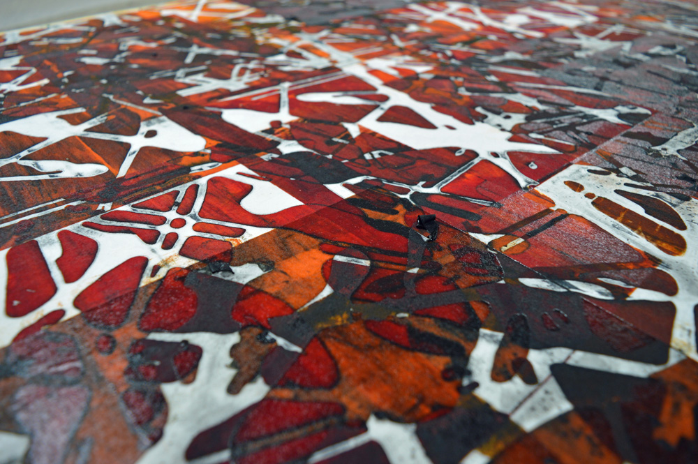
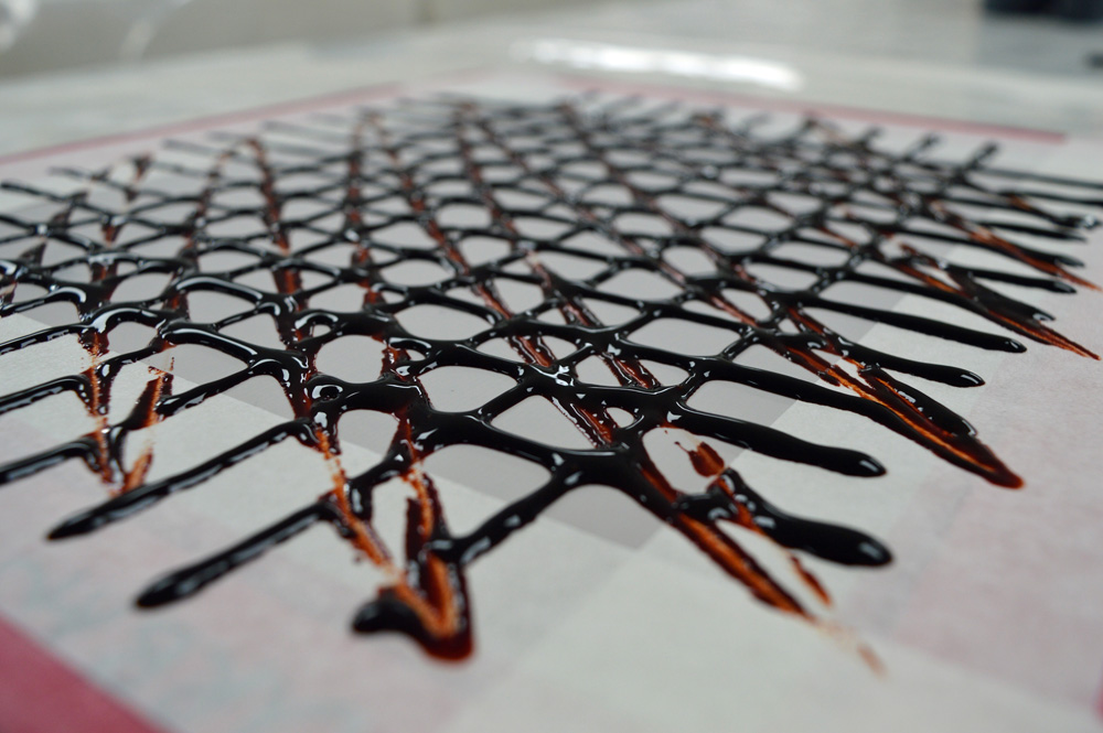
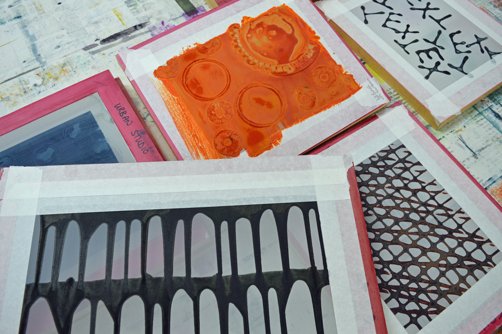
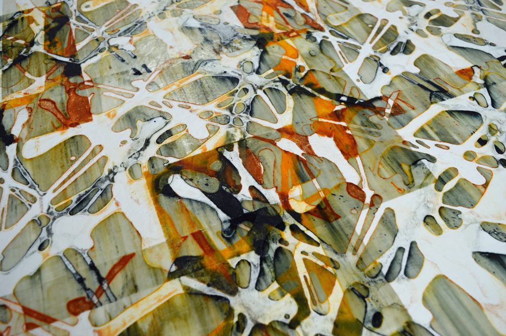
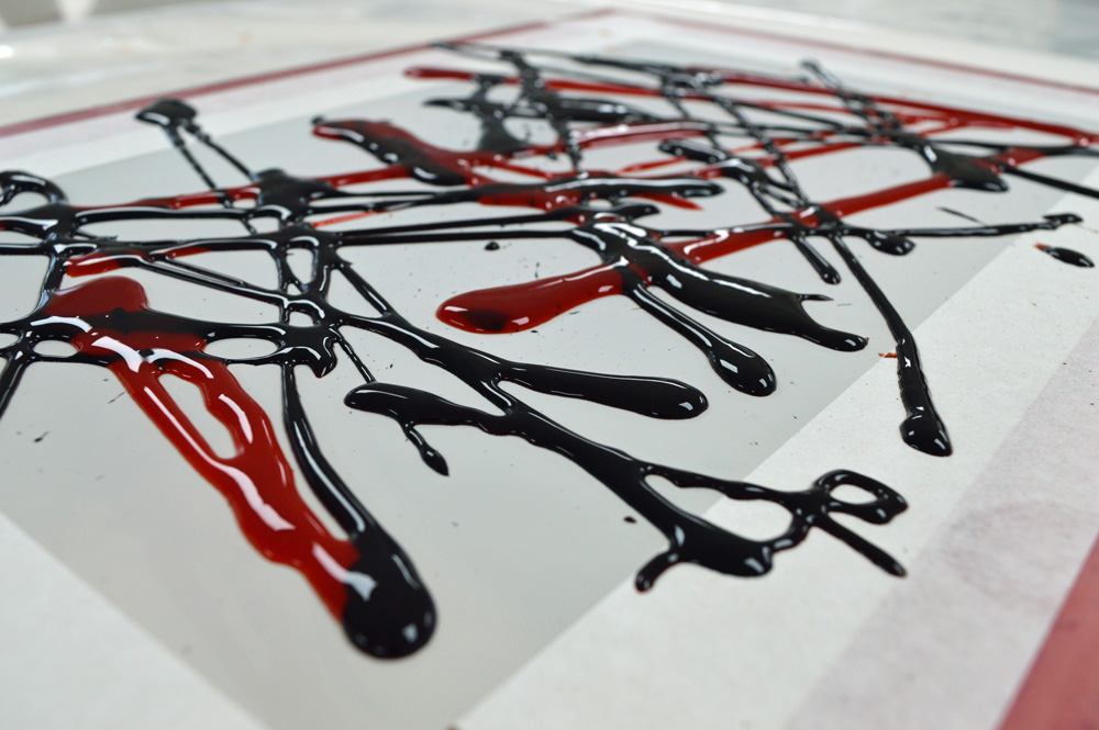
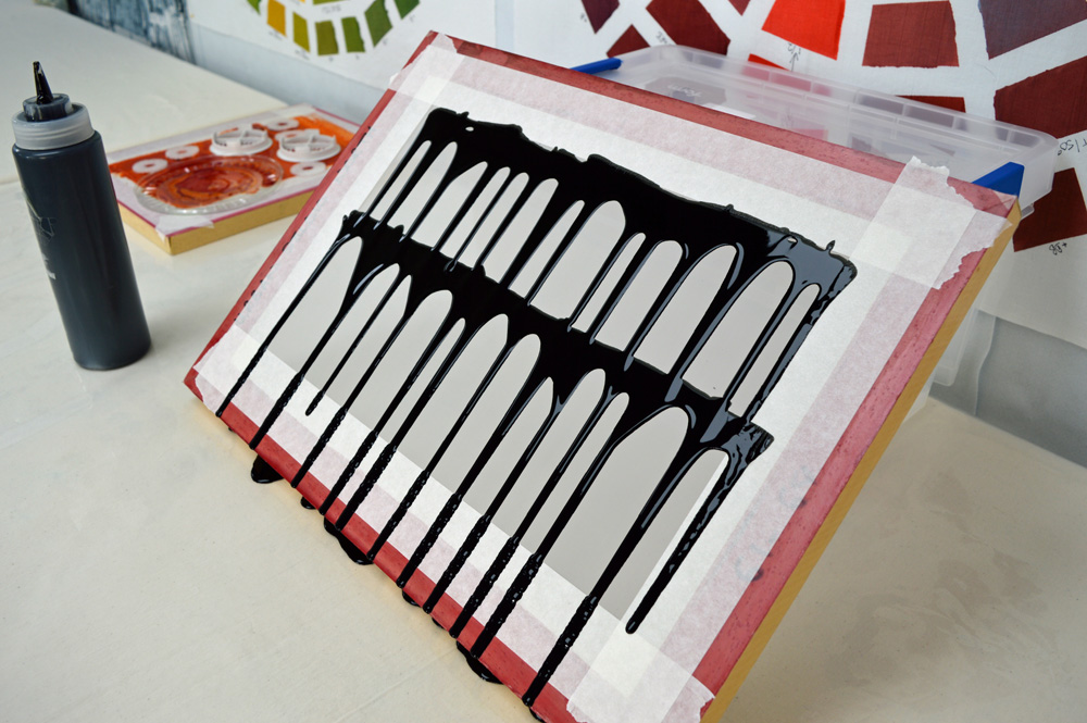
Not everybody wants to see rust and black fabric inspired by the decline in the cotton and mining industries. Strange but true. So this week I have been playing with other types of breakdown printing and with a slightly broader colour palette. I can’t quite bring myself to do pink flower inspired things or green landscape inspired things but I’ve had a thoroughly enjoyable time releasing my inner Jackson Pollock and squirting dye about. I may even let all my inhibitions go and print some screens at wonky angles. Blimey!